CASE STUDY
Averto: Keeping civilians in
conflict-affected areas safe


I landed this project through a three month UX design immersive course at General Assembly. Being a real-life practice course, I was assigned a live brief by Averto.
Along with a recent dip in user retention, the pandemic forced a reexamination of Averto's business model.
The Averto team came to us to help improve the user reporting process, report design and integration of social features that contribute to community engagement and information sharing.
ROLE:
User Experience & Interface Design, User Research
TEAM:
Keegan Brown
Chris McCabe
Karl Solano
TOOLS USED:
Figma, Illustrator, Photoshop
DURATION:
18 days
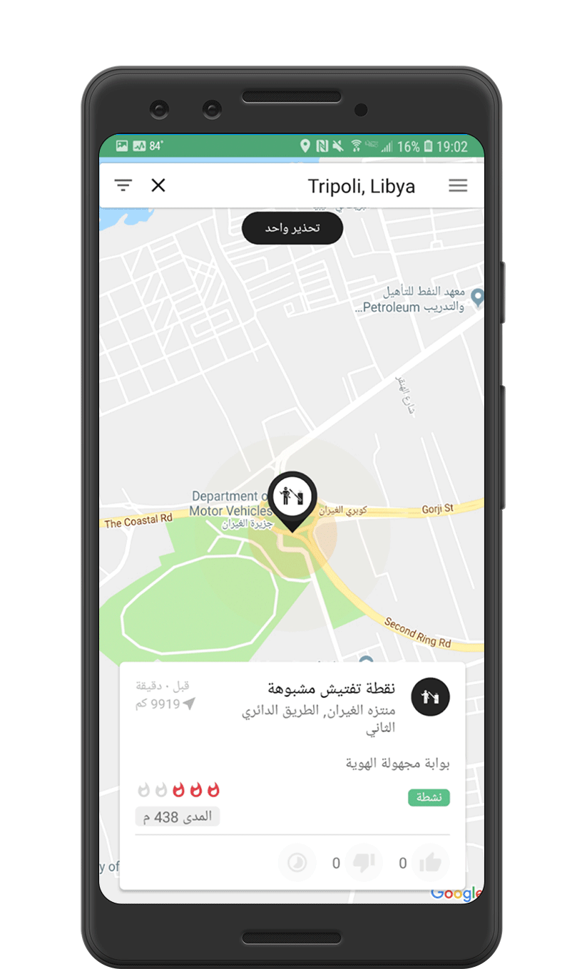
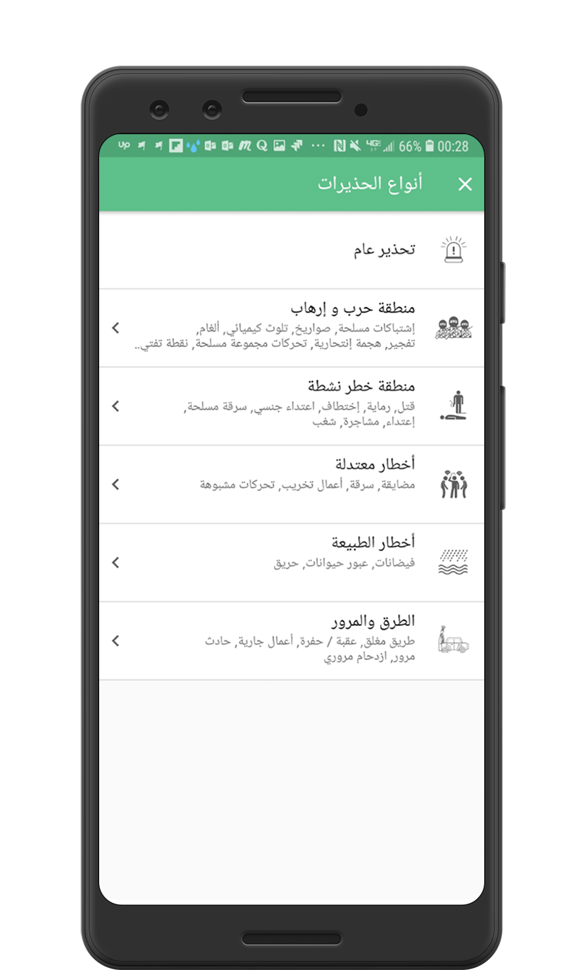
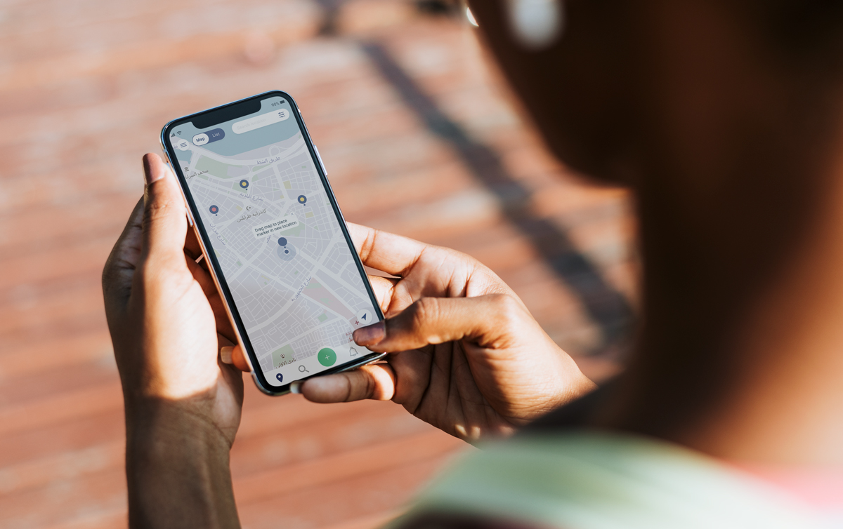
Current beta version of Averto
BACKGROUND & BRIEF
Understanding the goal
Averto is a crowd-sourced, situational awareness mapping app for civilians and NGOs in conflict-affected areas. It collects real-time, crowd-sourced conflict data & provides users reports on what is happening around them on a shared platform.
The beta version of the platform was released last year and is currently active in Tripoli, Libya with ~200k users. However, COVID and a decreasing number of users caused Averto to make changes. Averto started a new development and user business model phase in early January 2021, and are pushing hard to get the product-market fit and begin growing again.
The stakeholders’ initial ask was to create UI/UX mockups and wireframes of their new, cross-platform ecosystem. This would include a new user reporting process and new features such as geo-fencing, family location tracking, vaccine coordination, and social features that contribute to community engagement and information sharing.
Due to the length of the class and after a kickoff meeting with the stakeholders we narrowed our focus to the user reporting process, report design and the integration of social features to help user engagement
RESEARCH
Discovering users' needs
To better understand the user, competitive landscape and pain points with the current beta app we used the following research method:
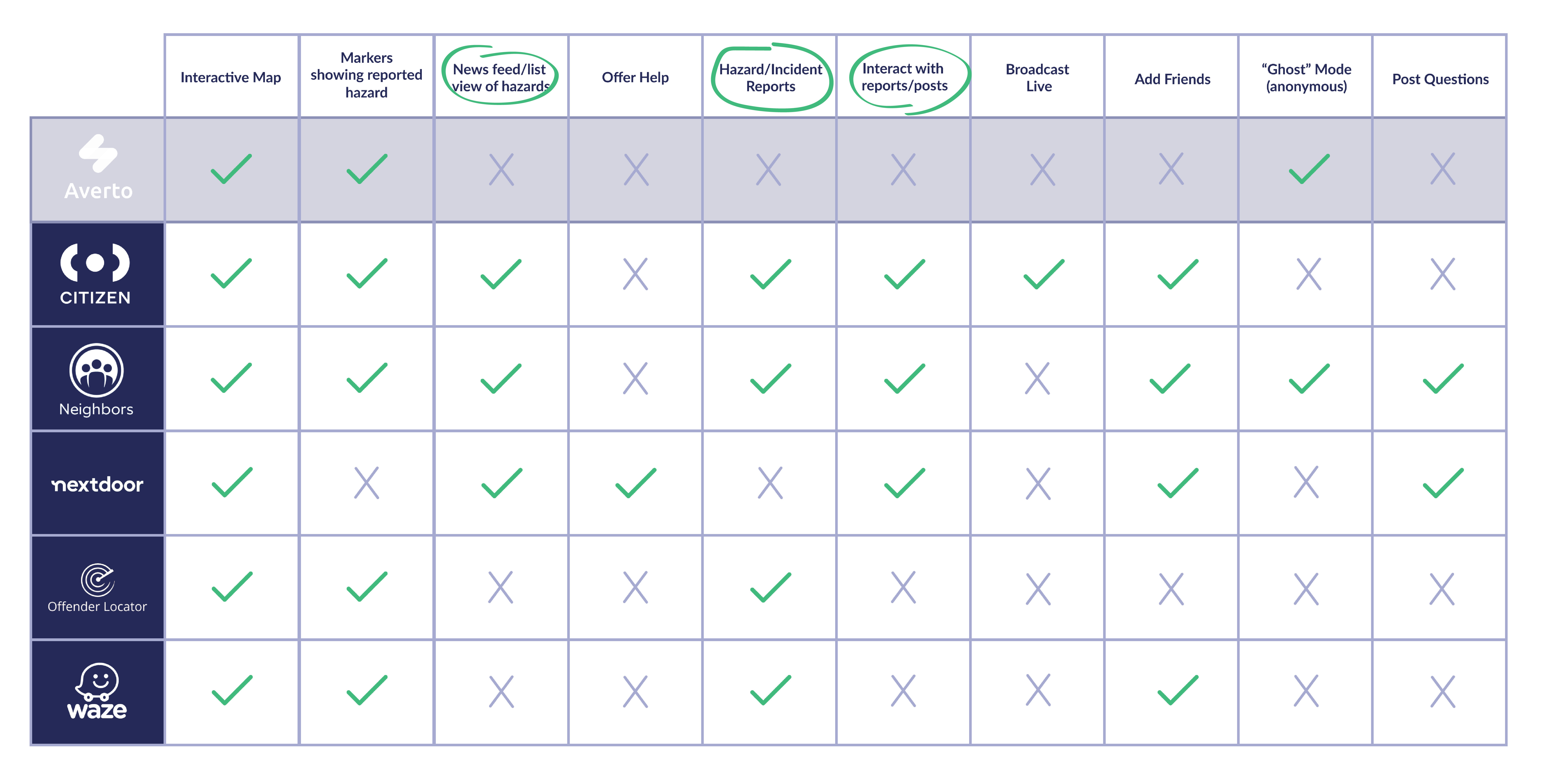
Comparative Analysis
Researched 5 apps used for reporting crimes and hazards, protecting communities and providing safe routes for users. After the analysis, we determined improvement was needed in ease of adding alerts, commenting/sharing, improved user engagement and a list/feed view of alerts.
User Interviews
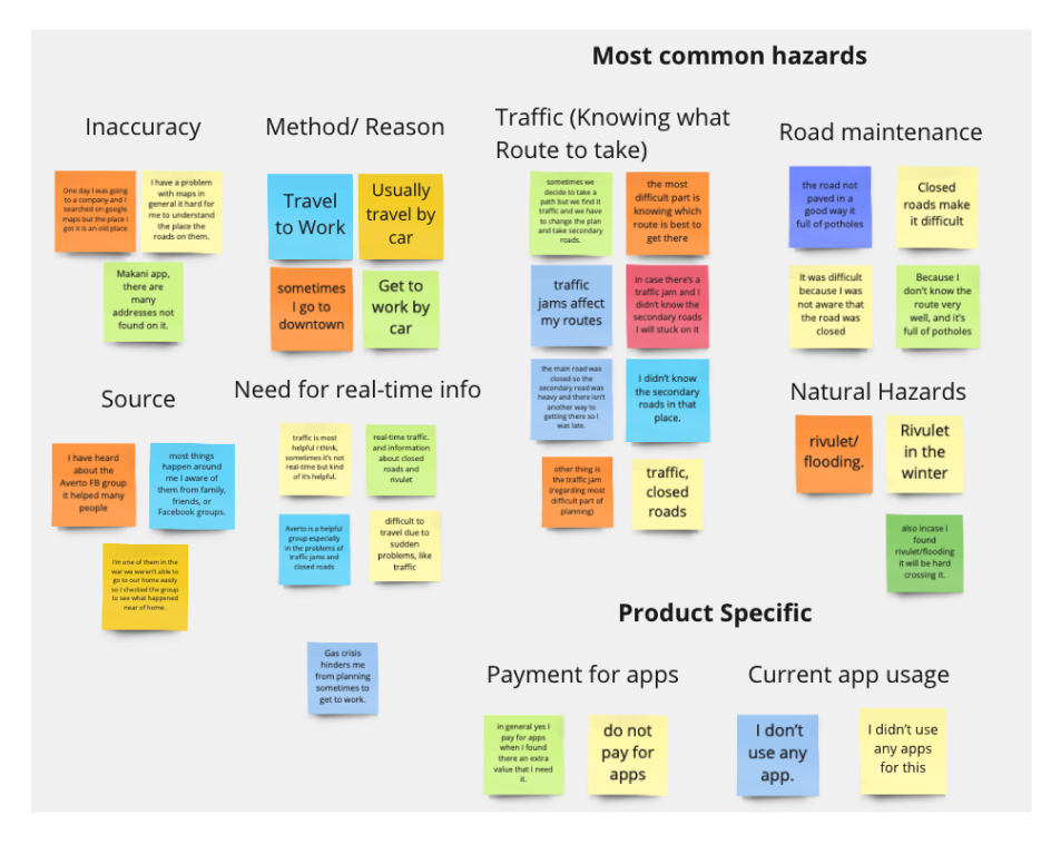
Averto is currently conducting user interviews on their experiences when traveling within Libya and their experience with the current app.Using affinity mapping we synthesized information from the completed interviews.
Card Sort
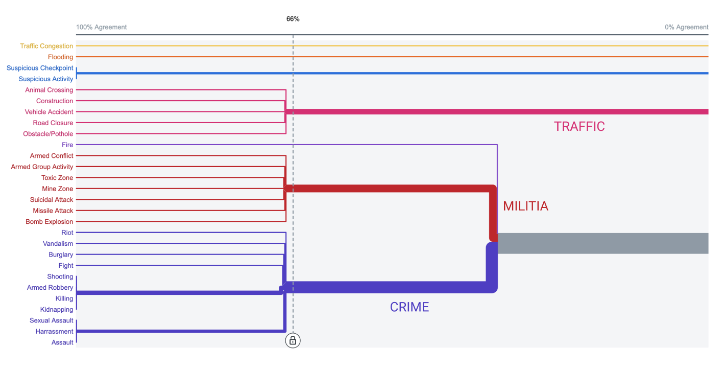
A card sort was completed with users in Libya to better organize alert types.
User Data
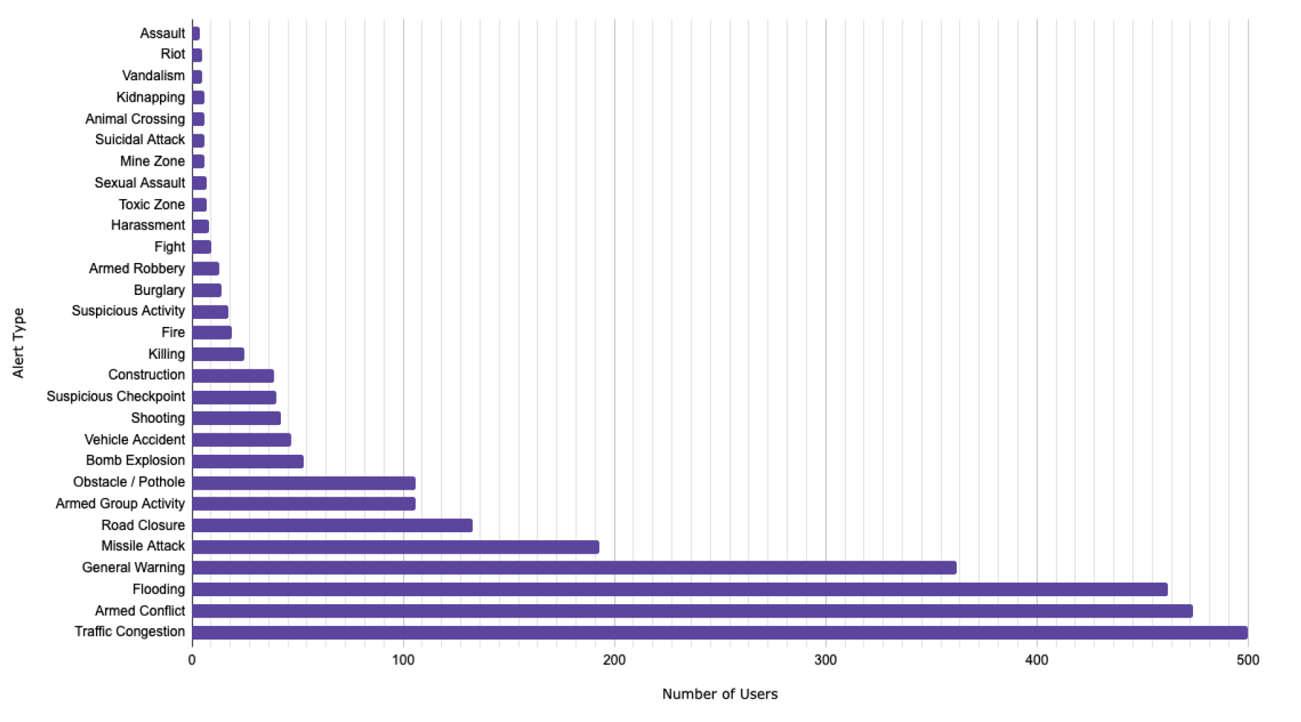
We analyzed 1 years worth of data from the beta app to further organize alert categories, determine author distance and user demographics.
Note: Due to the user base living in Libya and the short time frame, we had limited resources for research. If given more time/resources we would have liked to conduct more user interviews as well as surveys to better understand their needs.
Key Insights:
01 High demand for the app, but users have slowly decreased the past year—many moved from the app to an organized Facebook group.
02 Difficult to connect with others and engage with alerts
03 Traffic, armed conflict, flooding and general warning represent over ⅔ of all alert types
04 Averto is seen as a trusted tool to help the community, but users want to see more features around reporting.
05 Several features/buttons are unclear to users
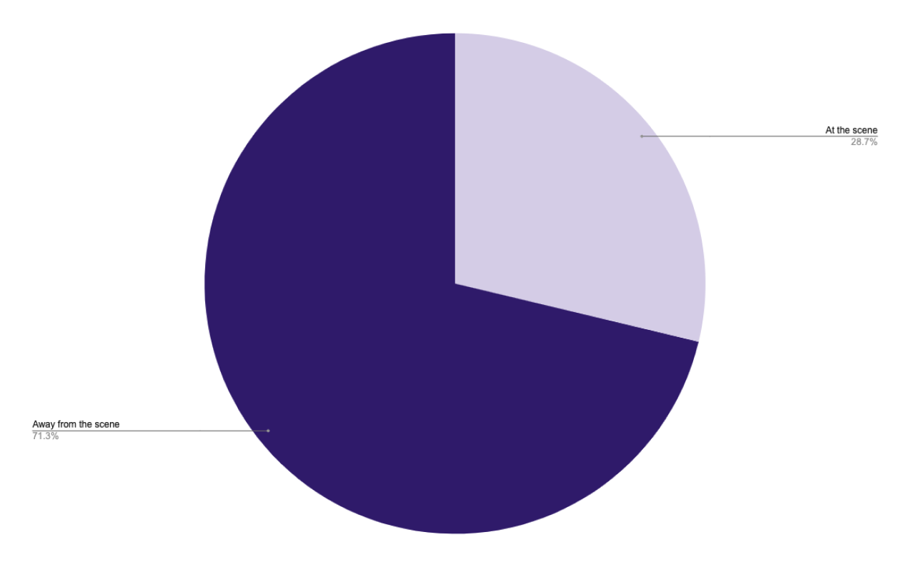
06 Over 70% of users report an alert away from the incident
A Trusted Source
“I have heard about the Averto Facebook group helping many people and I’m one of them—in the war area, we weren’t able to go to our home easily so I checked the group to see what happened near our home.”
Safety Needs
“The most difficult part is knowing which route is best to get there. Sometimes we decide to take a path but we find it traffic or conflict and we have to change the plan and take secondary roads.”
Declining Engagement
“At the beginning Averto was a good idea for our community, I love to share my experience with people. Reporting things, I used it many times but as you can see it’s nearly dead so I stopped using it because no one is using it."

DEFINE
Identifying the user & mapping the journey
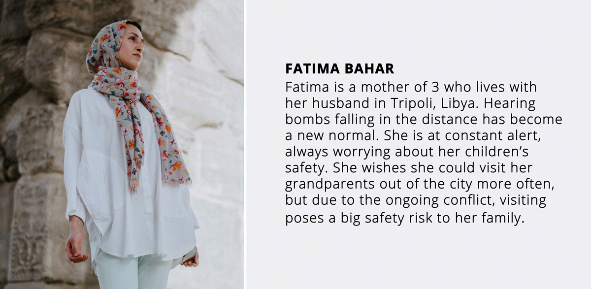
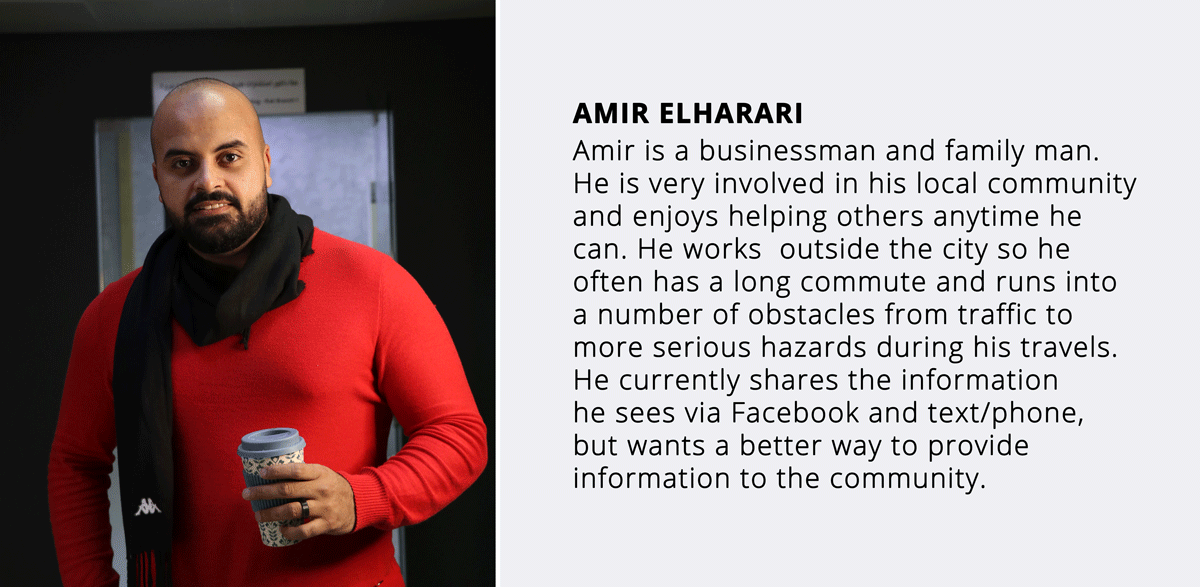
After diving into Averto's pre-existing database and reviewing interviews, we created Averto's first user personas to use for future designs. Before creating specific user personas, we made sure to take into account common trends found among the various users.
PROBLEM
Fatima needs a way to travel safely to and from her family outside of town, while having real-time information regarding threats from a trusted community.
Amir needs a quick and efficient way to report and share any potential hazards, in order to keep his community aware and stay safe.
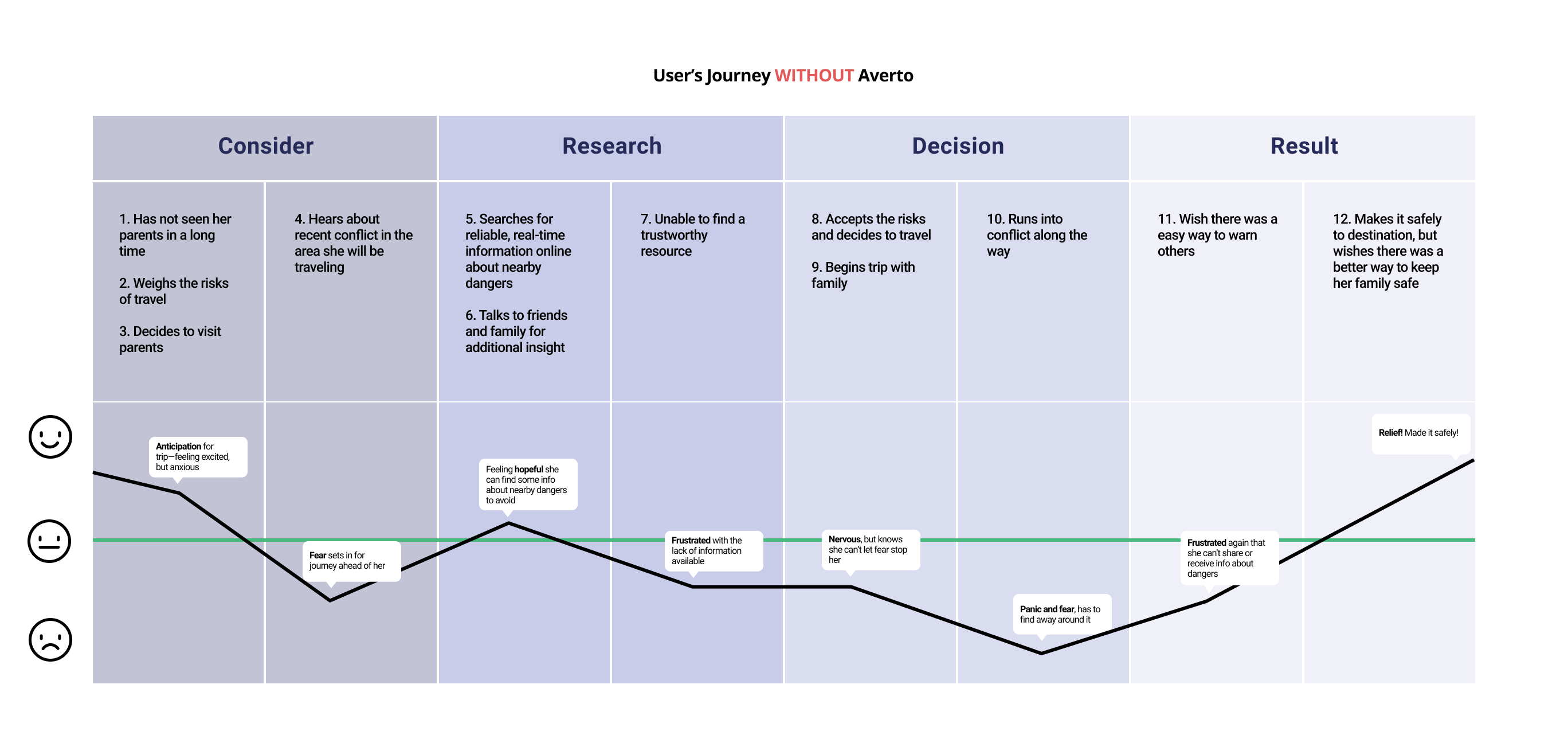
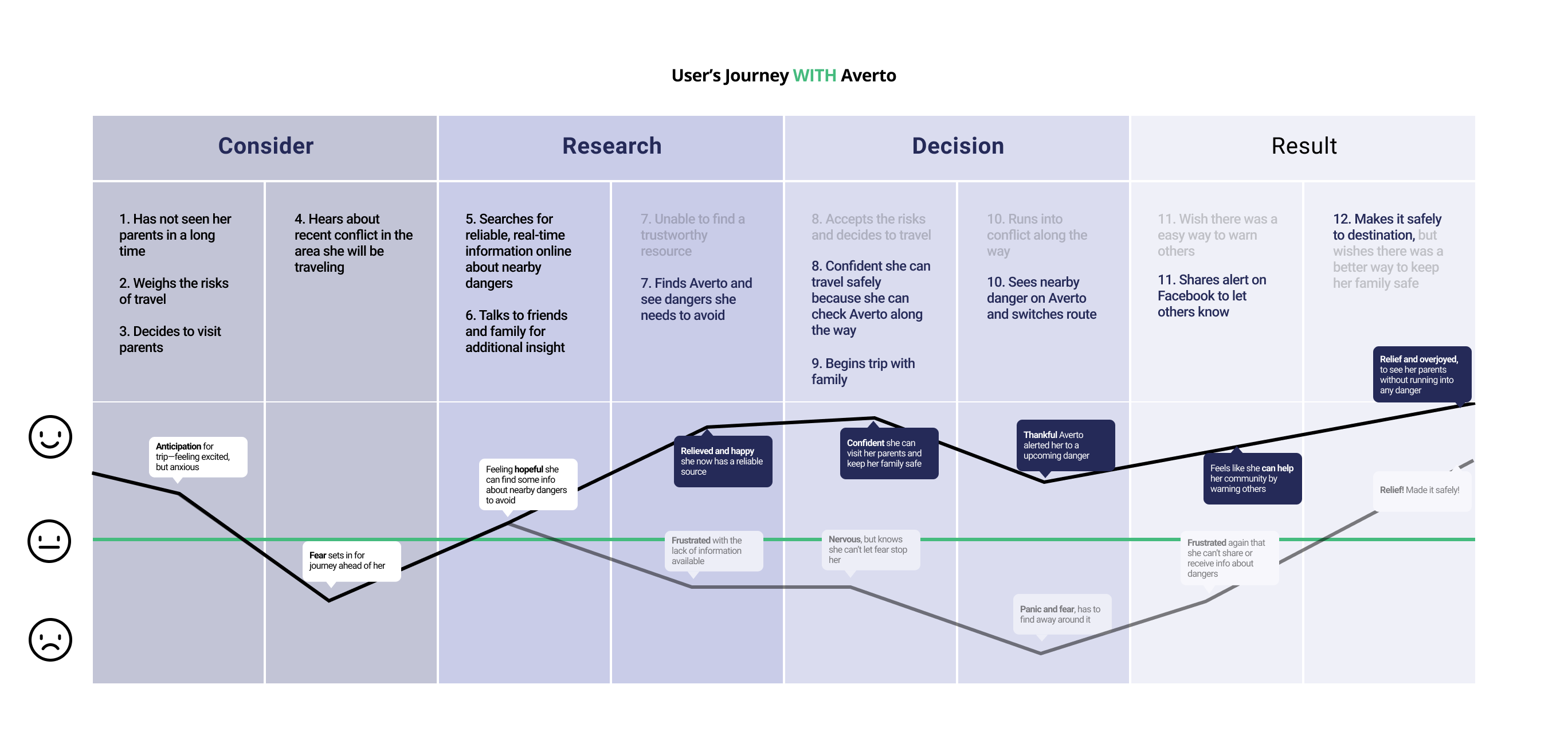
JOURNEY MAP
In war-torn Libya, Fatima would like to visit her family out of town, she wants to be aware of threats along the way in order to make it safely to her destination.

USER FLOWS
Two new user journeys
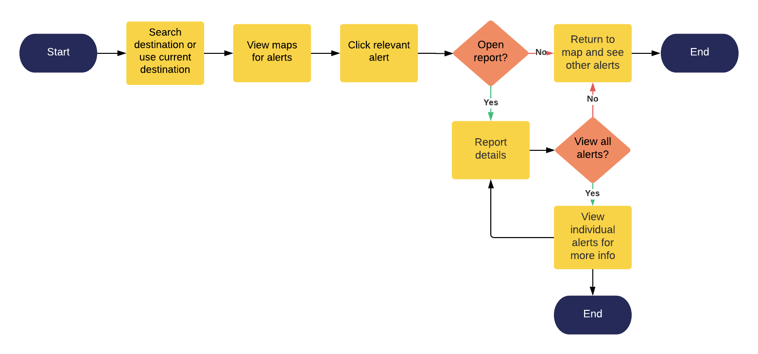
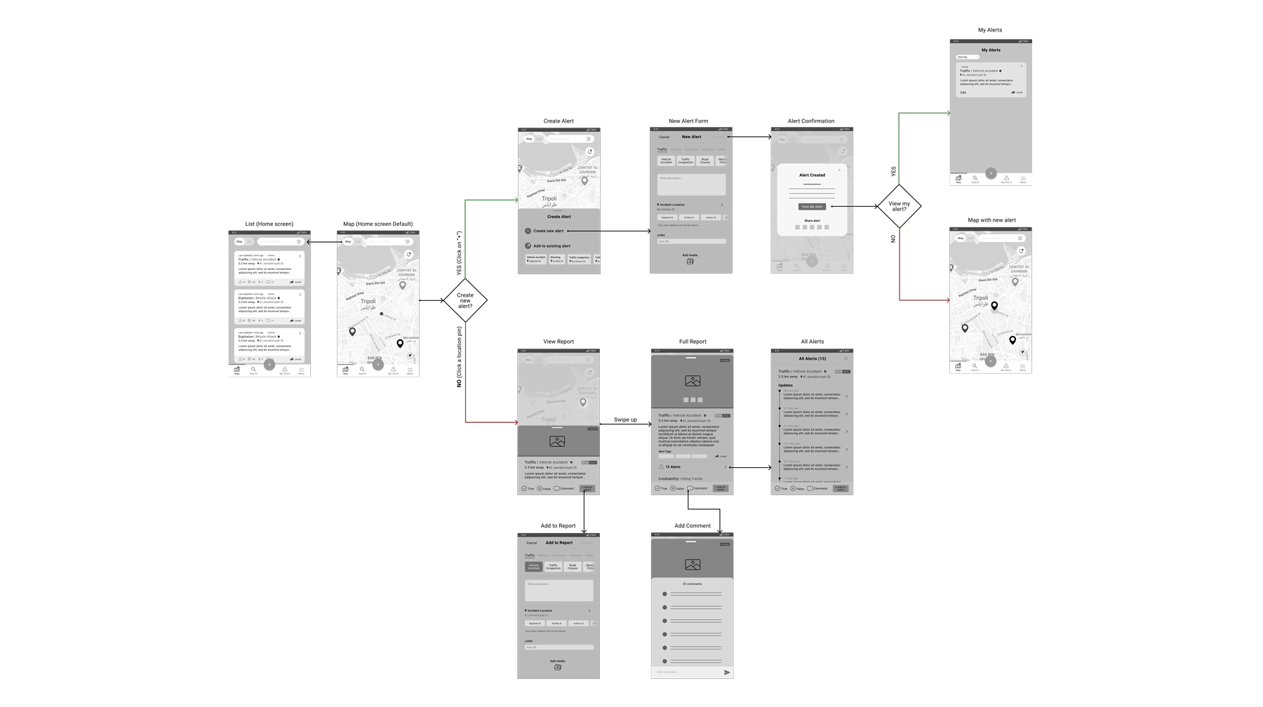
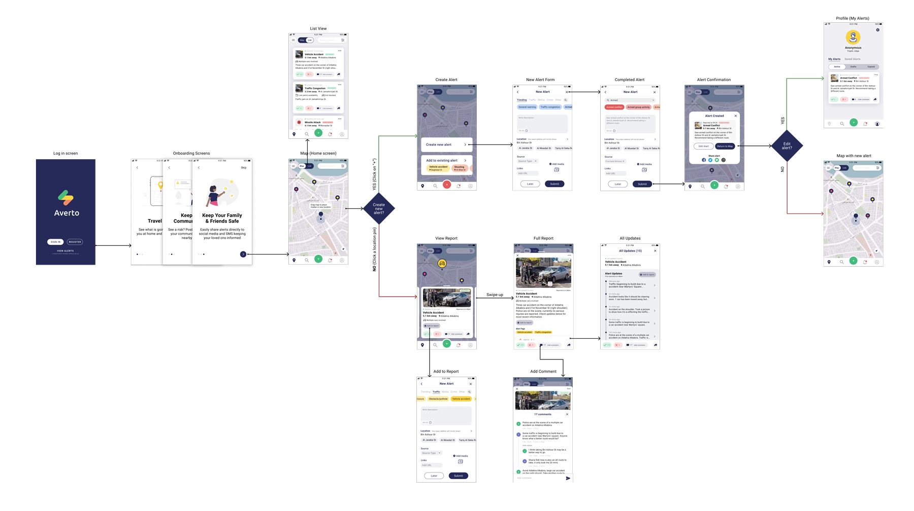
Two user flows were created as reference when creating wireframes and performing user tests. The first flow represents the journey Fatima (persona 1) would take to view reports and the second flow shows the flow Amir (persona 2) would follow to create an alert.
SOLUTION
How might we help Fatima travel safely in and around the city?
How might we help Amir share his information with the community to keep them more safe?
IDEATE
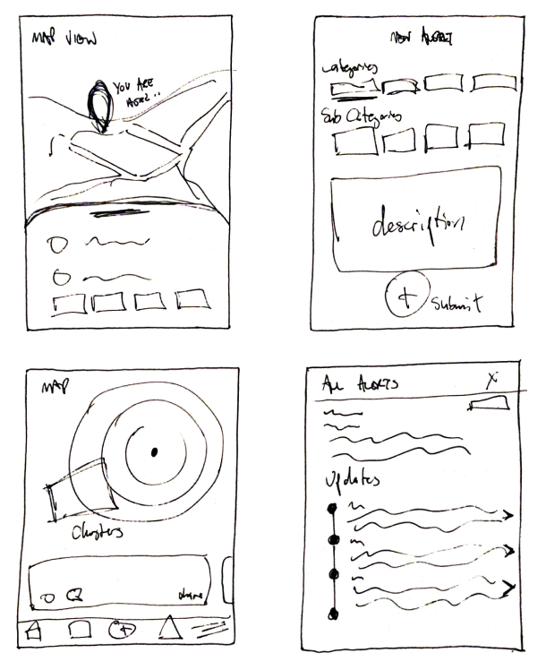
Putting pen to paper, exploring the redesign
Using the knowledge we gained from our research and with the client and users' goals in mind—we began to ideate using the existing framework from the current app.
The redesign focused around our 2 user flows:
1. Goals for the new alert submission process and design
• Fast and easy report submissions
• Encourages and allows details to be captured if the user has time
• Flexible and dynamic data capture
2. Goals for the new report design
• Show aggregated details and analytics
• Design a modular pattern-based style where similar types of analytical reports/labels/categories of data can be added
• Increased report engagement and shareability
TESTING
The design, test, iterate loop
We created 4 prototypes, with increasing fidelity—testing each one with interviewees and users. With each round, new iterations were made to fit the roadblocks that came up along the way for a seamless experience.
Users were asked to complete 2 tasks during usability testing:
1. You are traveling to your family in a nearby town, but there has been plenty of flooding as of late. You see flooding along your route. Show me how you would create an alert for this, along with a description.
2. You are interested in alerts that have happened nearby. Show me how you would find more details about a specific alert.
Key Feedback Received for Low-Fi Prototype:
• Unclear how to expand reports from the metadata view
• Navigation caused some confusion
• Buttons lost in the expanded report view
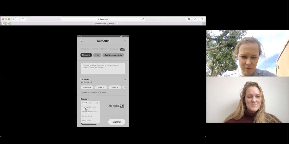
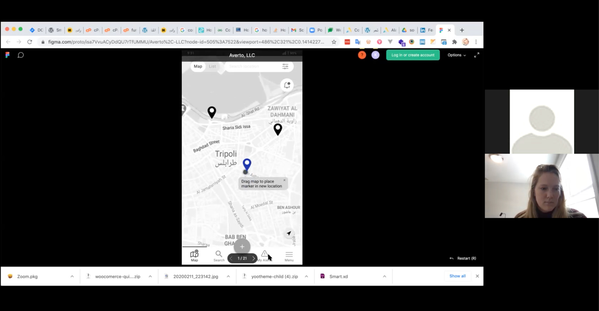
Due to COVID, all tests were done virtually over Zoom.
Iterate, Iterate, Iterate
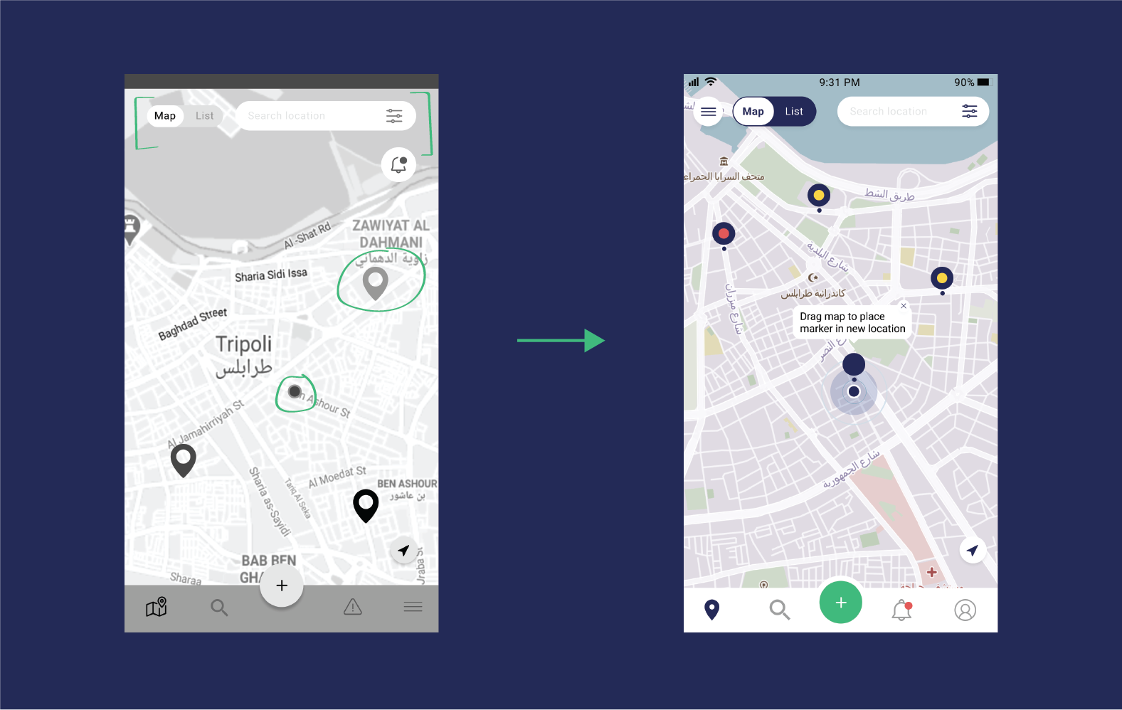
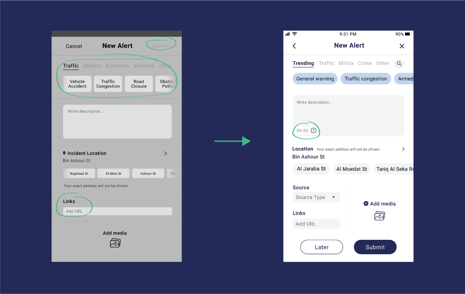
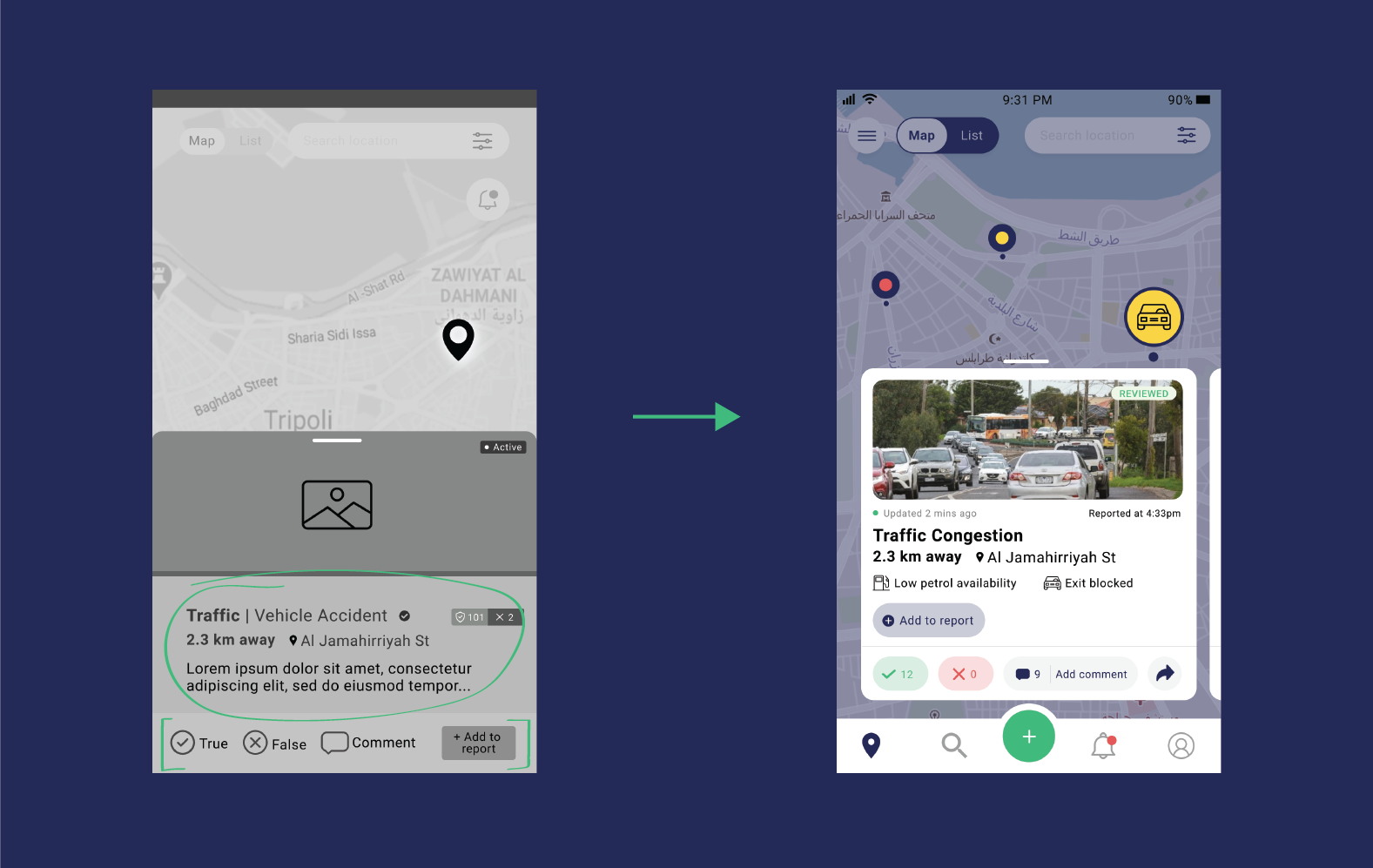
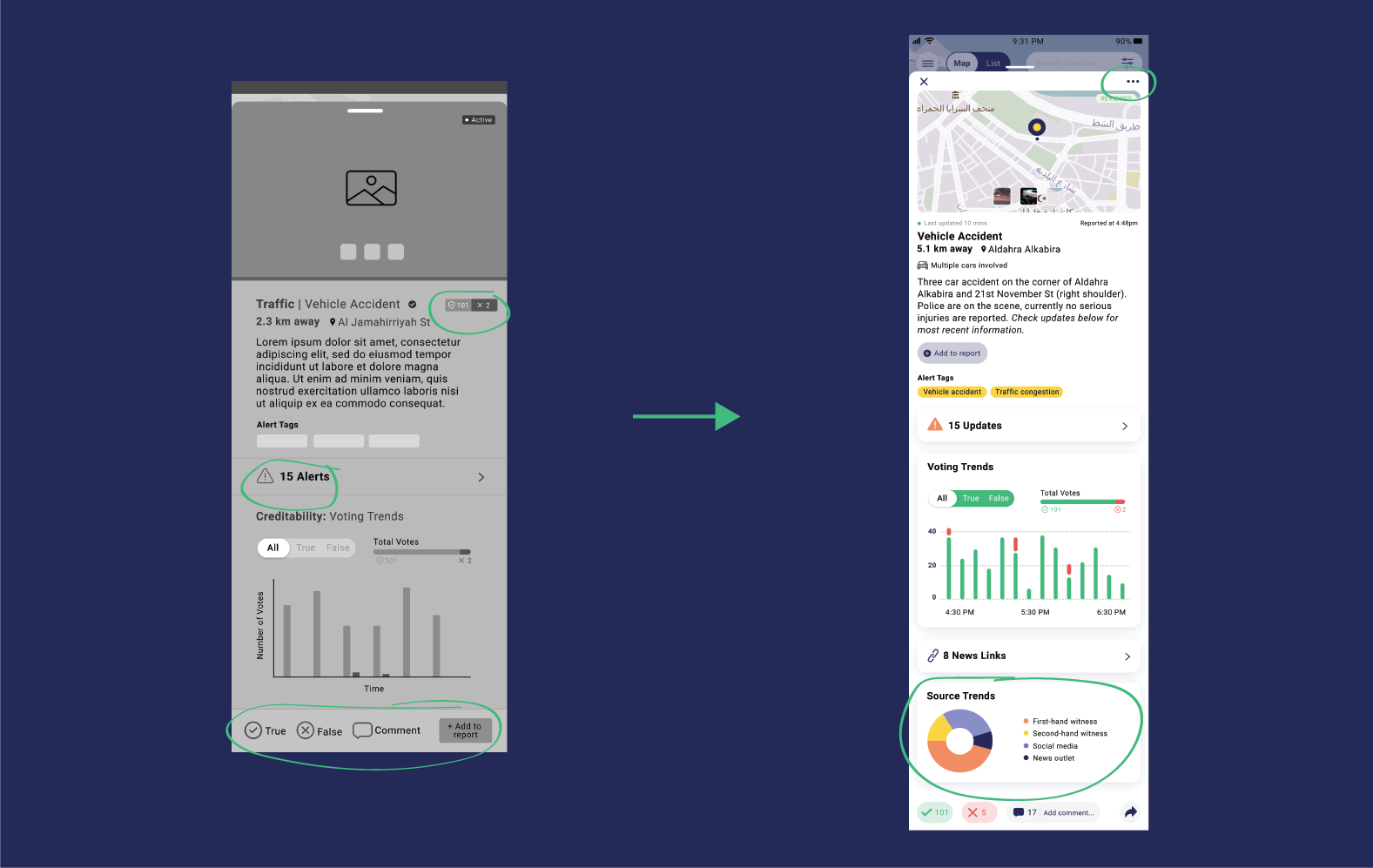
Working closely with the stakeholders, there were several rounds of iterations and changes that needed to be made. We took into consideration the various behaviors from user tests while making sure it was within our timeframe to implement changes for our deadline. We had to prioritize what the "nice-to-haves" would be and what our "must-haves" were.
THE SOLUTION
A refreshed reporting process
Explore the final prototype and highlights below. Users can now:
- Quickly add alerts with the new streamlined alert form
- View detailed reports and add to existing reports
- Save alerts as drafts
- Quickly see alert severity with new color coding
- Share and comment on alerts
FINAL PROTOTYPE
Create alerts on the spot (or save for later)
Using user data and card sorting—alert types were reorganized based on the most used alerts. A search bar was also added to allow users to quickly search through alert types.
Previously, the beta version of the app made users go through two pages to submit a report. We cut it down to one for a quicker submission. Also, the implementation of a "save for later" button was added because 75% of users don't submit a report at the scene.
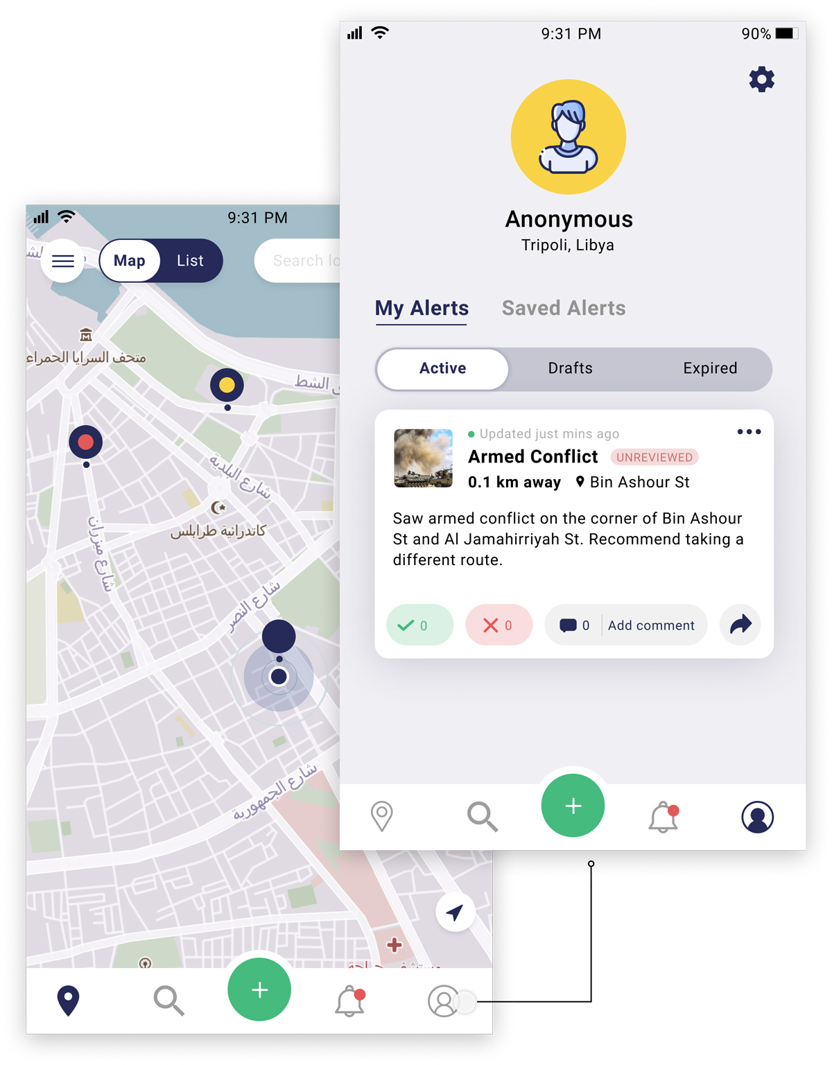
History of your alerts
Users now have a home base with all their active, drafted and expired alerts to refer back to or make edits.
To help with user engagement, users also can view alerts they have saved from other users to follow any updates.
New detailed reporting
Users now have access to a whole new set of data—voting trends, all alerts connected to the report, links, source trends, and additional moderator tags.
These additions will increase user credibility allowing users to feel safer and continue to see Averto as a trusted source.
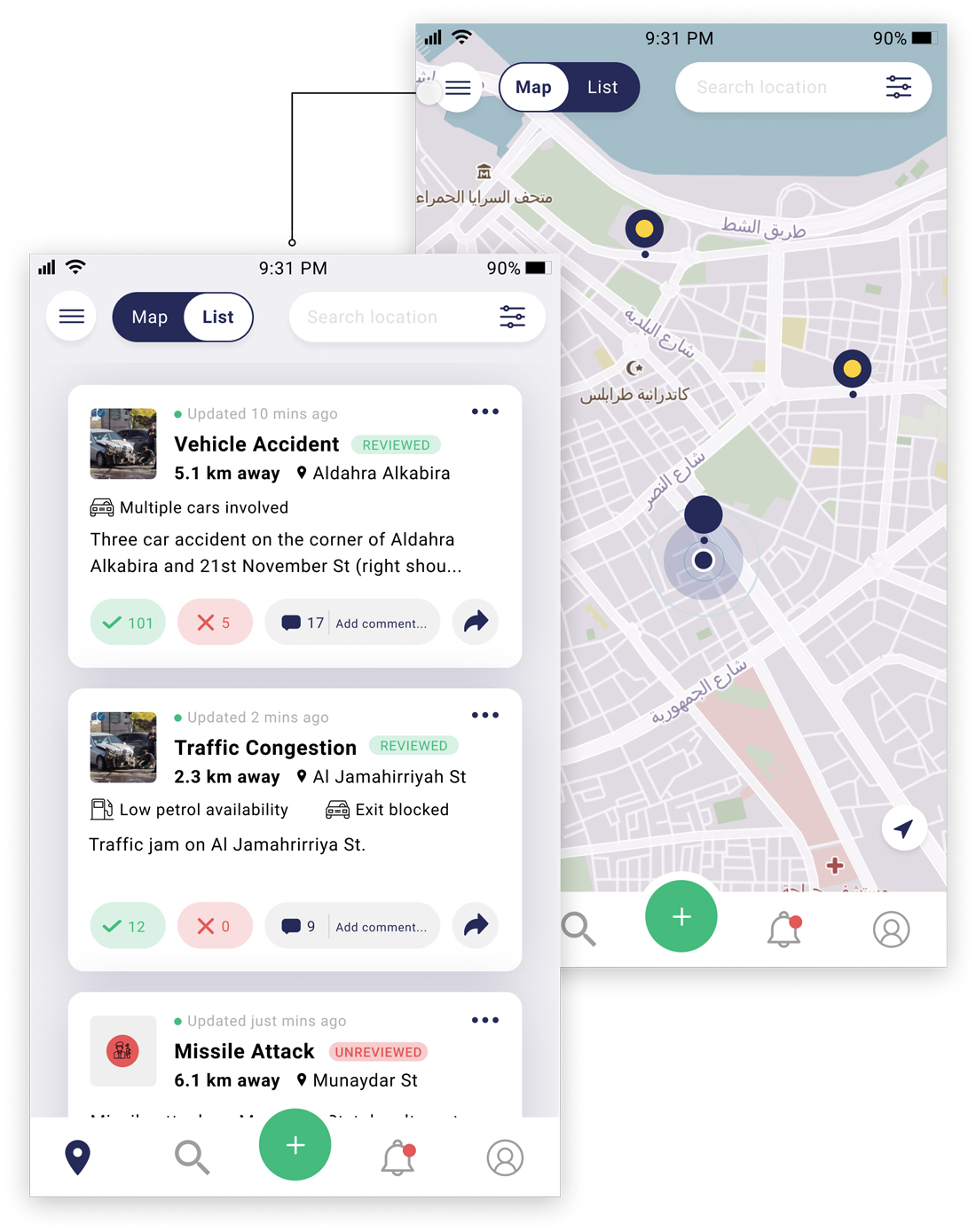
New way to view alerts
With a simple tap, users can now view all alerts nearby in an easy to read format. In research, users expressed frustration with not being able to see all alerts at once due to an influx of pins (alerts). This addition helps alleviate that pain point.
Engaging and sharing with the community
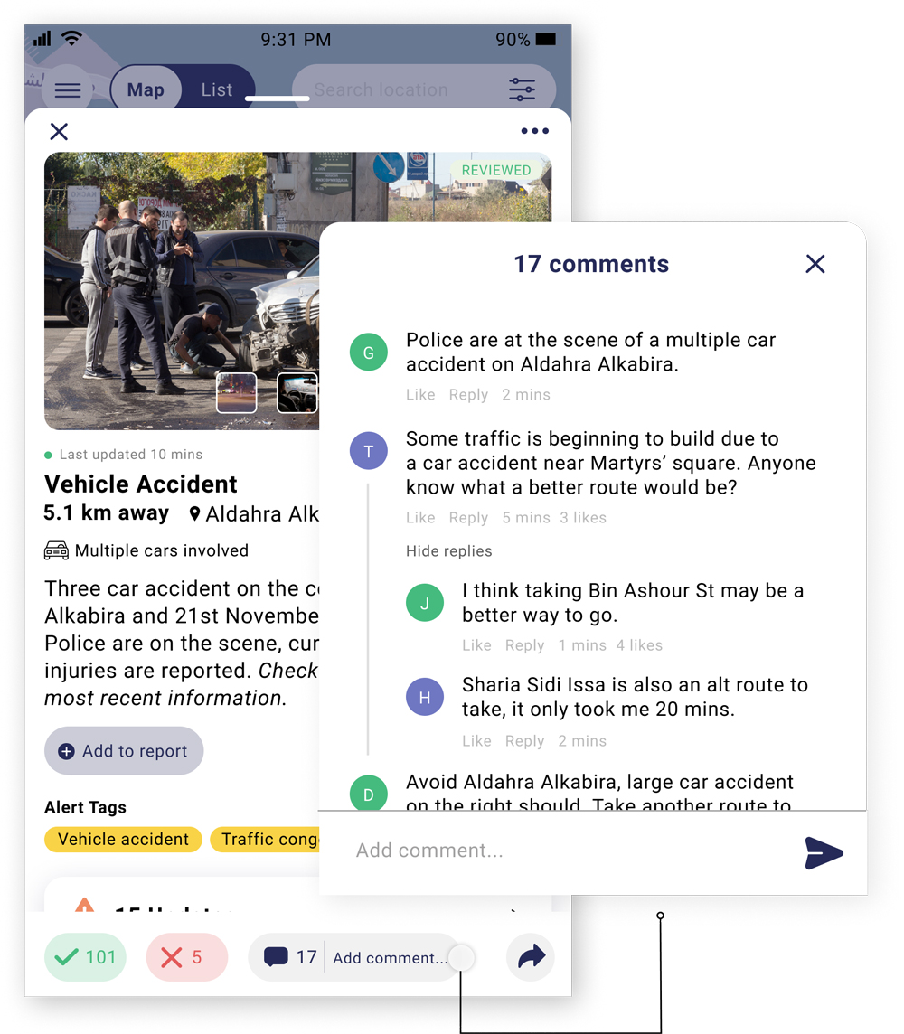
With users migrating to a Facebook group instead of Averto and from information learned in user interviews, we knew individuals needed a way to communicate with others within the app. We added a commenting feature and easy sharing for alerts so users can engage with their Averto community as well as with their local community.

CONCLUSION
What I would have done different
Because of our lack of time and resources we missed out in opportunities to make this even better, specifically around user interviews and user testing. If we had the opportunity to push this even further, these are what I would do differently:
MORE USER INTERVIEWS
Averto had just started user interviews with their Libyan users the week we began working with them. Because of this we had access to only a few completed interviews. If we had more time we would: 1, like to help come up with questions to be asked. 2, have at least 10 interviews to pull from during research.
TEST IN PHYSICAL SETTING
Due to the user base being located in Libya and my team working remotely around the world—testing had to be completed via Zoom and from a laptop. Given more resources for the next round of testing, we would like testing to be done in person and on a mobile device to get a better understanding of usability
ACCESSIBILITY & LANGUAGE CONSIDERATIONS
Averto will have to be translated into Arabic, given more time and resources we would have liked to work closely with a native Arabic speaker to better understand design differences. Also, spending more time taking certain accessibility needs into consideration.
Next Steps
The Averto team will be taking our research, design and testing results into their next phase for the app. They are hoping to launch the new version of Averto using our design and consultation by the end of 2021.
Additionally, future features we've considered for Averto are mapping an specific area using a polygon, collapsing map markers as users zoom out and proximity triggered push notifications for when users are near an incident.
Thanks for stopping by, let's chat!
