CASE STUDY
GoToSea: Revamping the cruise search

When it comes to cruises, there are a lot of different options to think through—where to go, what cruise line or cruise ship, the duration of the cruise, price and much more. After joining the GoToSea team, I saw a need to improve the filters to make it easier for users to find a cruise that fit their budget and lifestyle.
ROLE:
User Experience & Interface Design, User Research
TOOLS USED:
Sketch
DURATION:
1 month
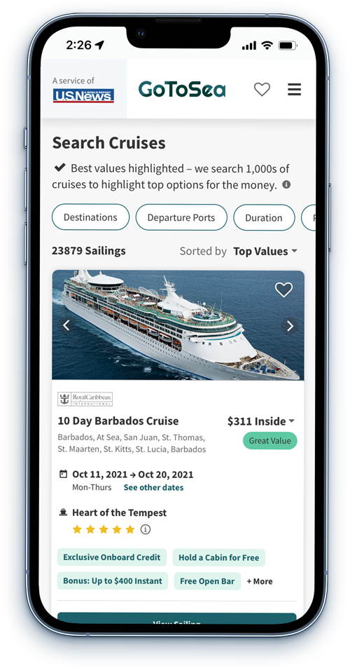
Old Filter Design
BACKGROUND
Understanding the goal
The previous filters used a simple chip button—each filter had it's own chip button and each opened up their own modal. Though this got the job done, I knew there were changes I could design that would make the filtering process easier for users.
Preliminary Goals:
- Make the filtering process faster and more efficient.
- Increase the number of users that click a sailing and move through the booking process.
- Create a design that is flexible—allowing for new filters that highlight different features of the ship or other unique differentiators.
RESEARCH
Discovering pain points
Competitive Analysis
Analyzed 12 different online travel booking sites to determine how similar businesses to GoToSea treated the many different options there are to sort through when booking travel.
User Tests
Created unmoderated user tests which had users compare the GoToSea search filters to our compeitors and other travel sites.
External Research
Reviewed case studies, design patterns, and guidelines for filters.
Data
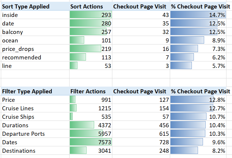
Evaluated GoToSea's filter data to determine which filters were used the most, which filters correlated to users booking cruises, and which filters users were not using.
Key Insights:
01 The filters that most correlated to visiting the checkout page (Price, Cruise Lines, and Cruise Ships) were the least used.
02 The filters that least correlated to visiting the checkout page (Durations, Depature Ports, Dates and Destinations) were the most used.
03 Most competitors use a filter modal that combine all filters rather than having individual filters for each filter type.
04 On mobile, users often do not use the horizontal scroll to view other filters—therefore there is a missed opportunity for users to better sort their cruise options.
05 Users frequently mentioned the time it takes to go through and select each filter, particularly on mobile.
PROBLEM: Filter selection tools are too cumbersome leading to higher bounce rates, user frustration, and lower conversions.
Opportunites for new features
- Separating destination, dates, and departure port from other filters.
- Create a filter modal that combines all filters so users can make their selections all at once.
- Add in other specific filters that allow users to customize their search even further.
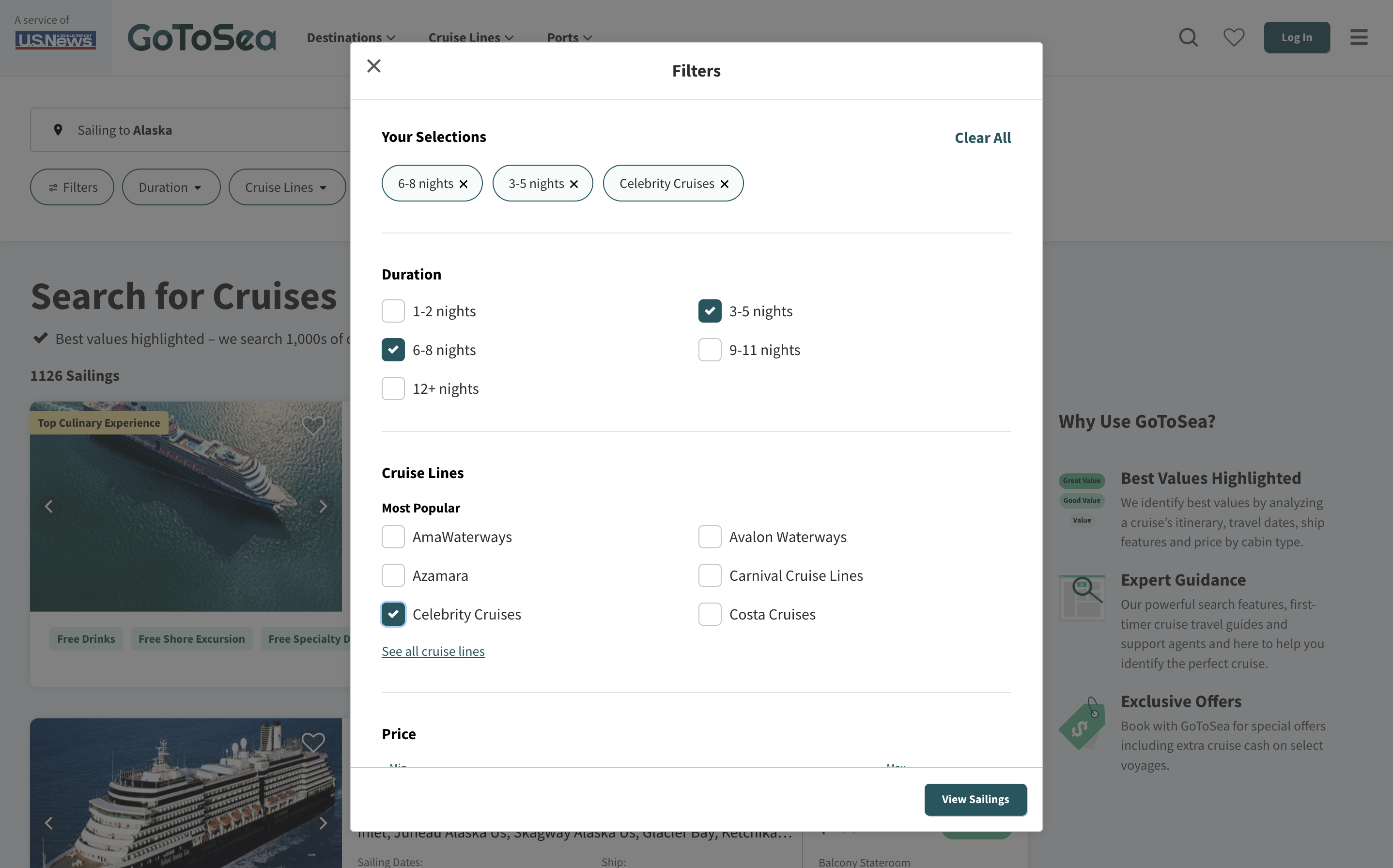
- Show selection made within modals—easy way for users up clear selections or see what selections they have already made.

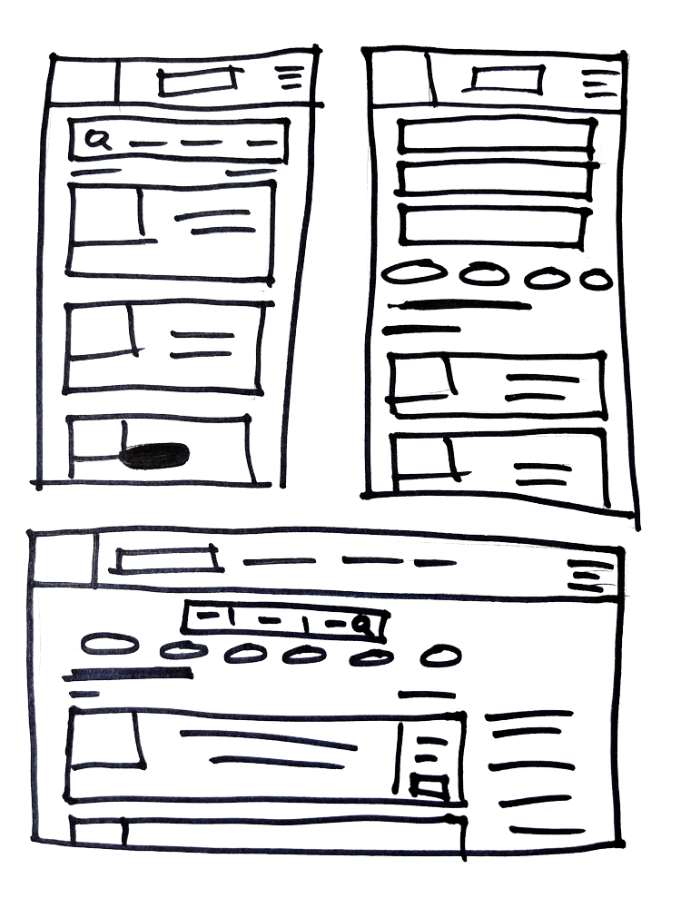
IDEATION
New filter design
1. New search bar
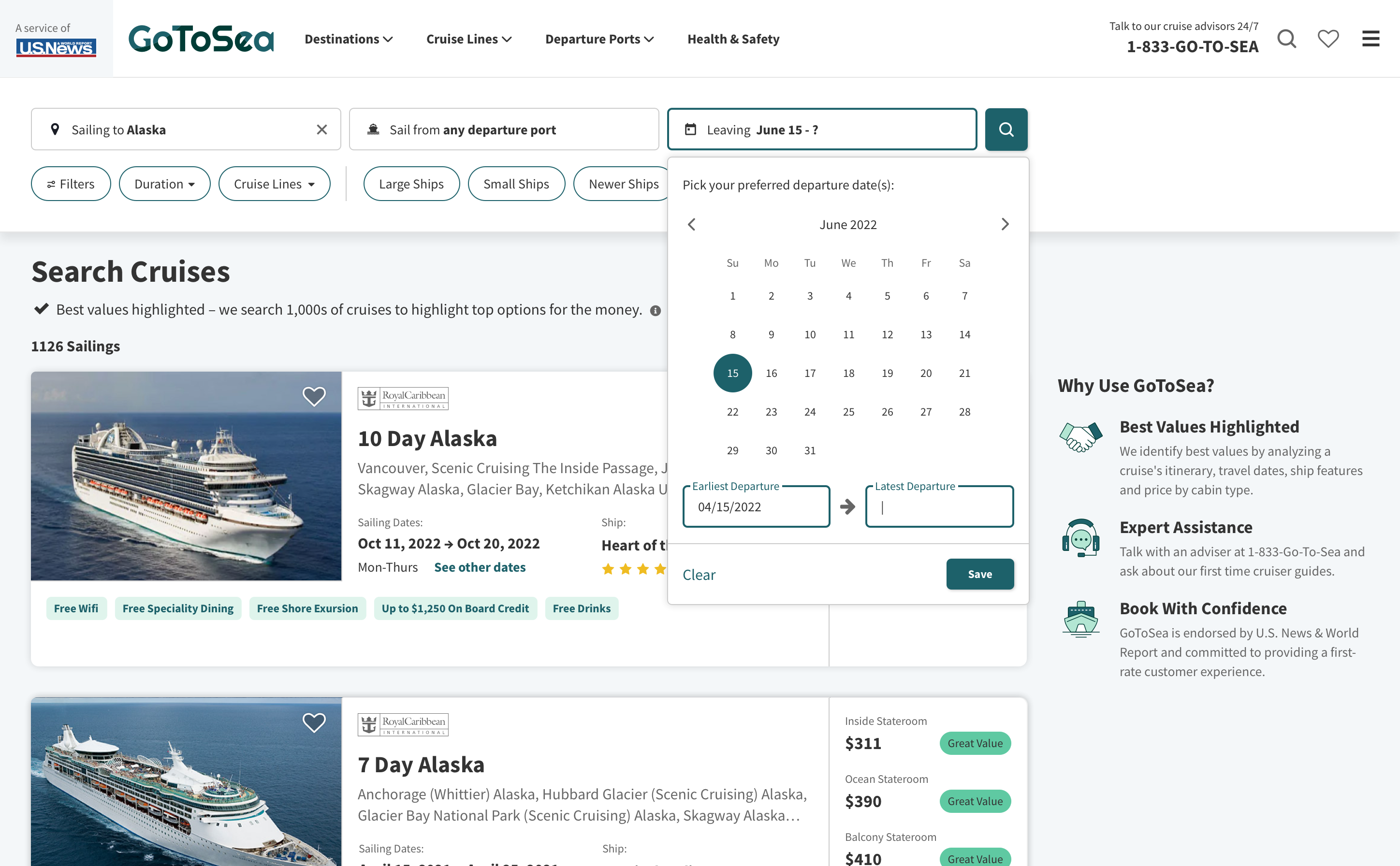
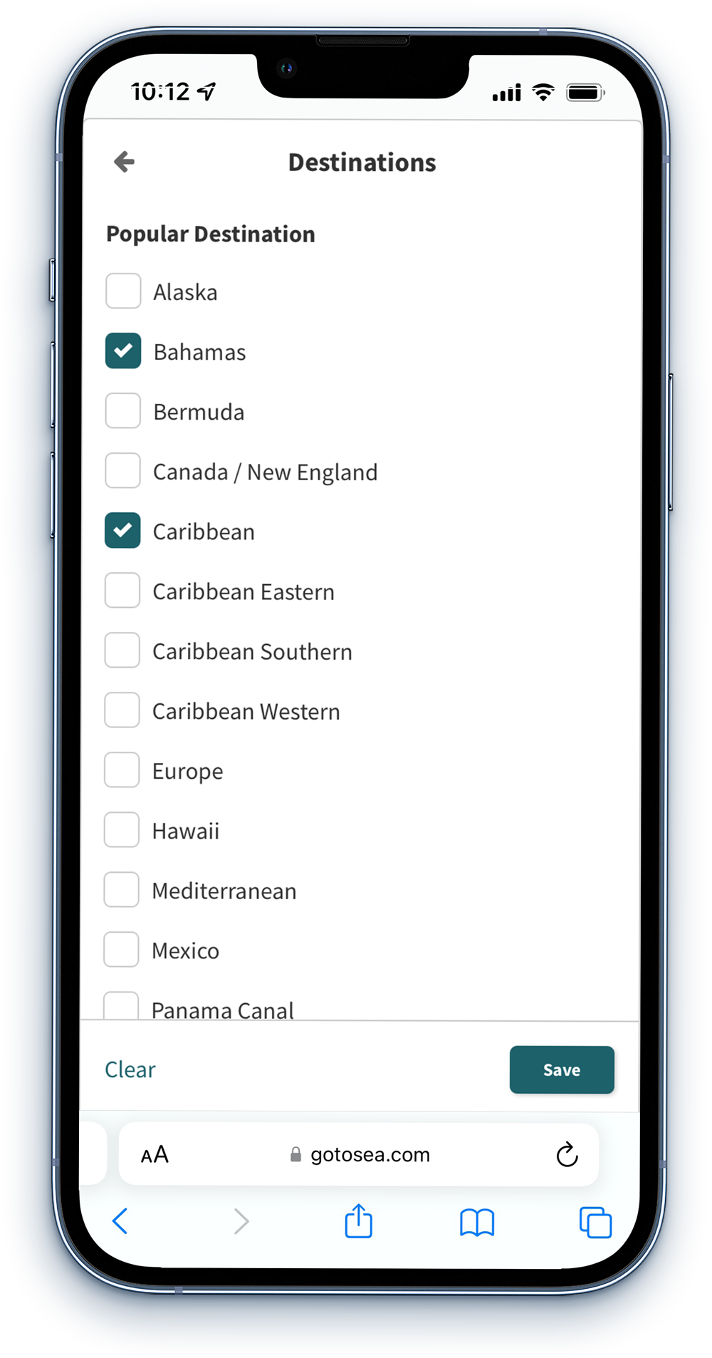
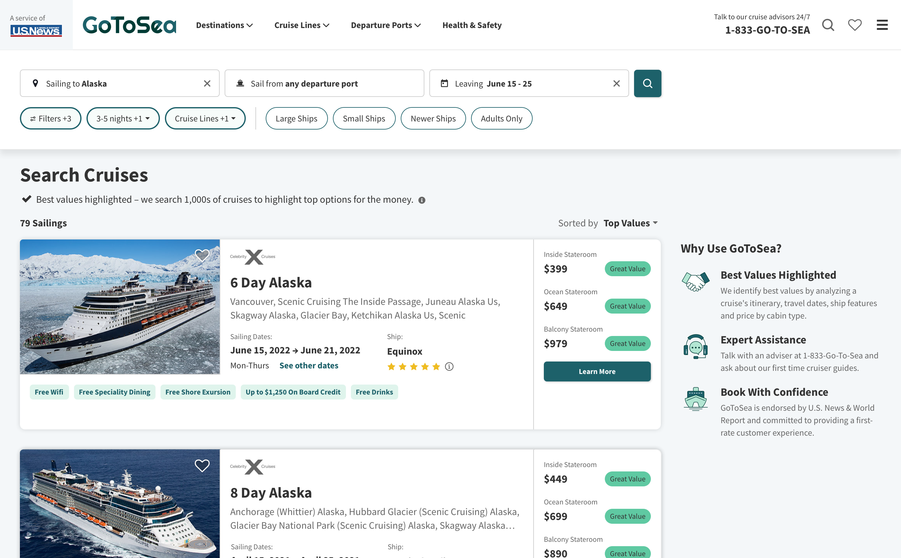
A new search bar was created for users to input their desired destination, departure dates, and departure ports.
2. Updated filter modal
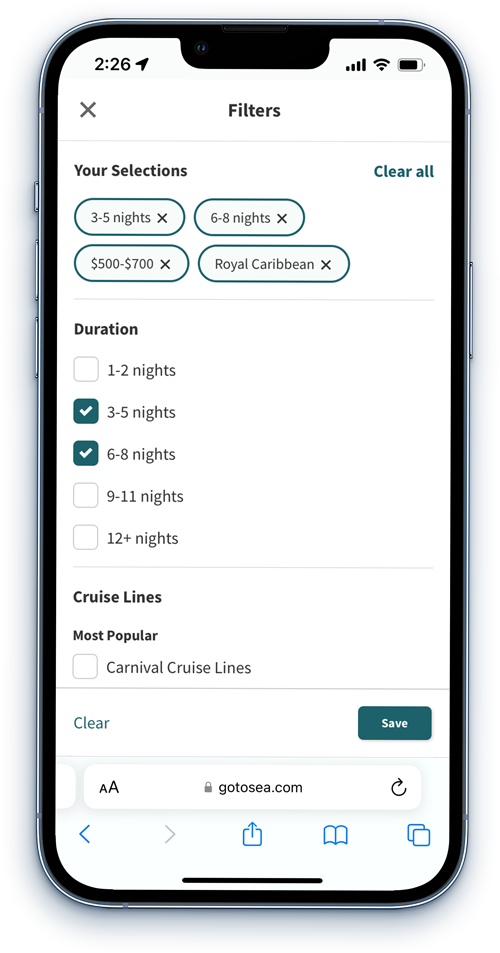
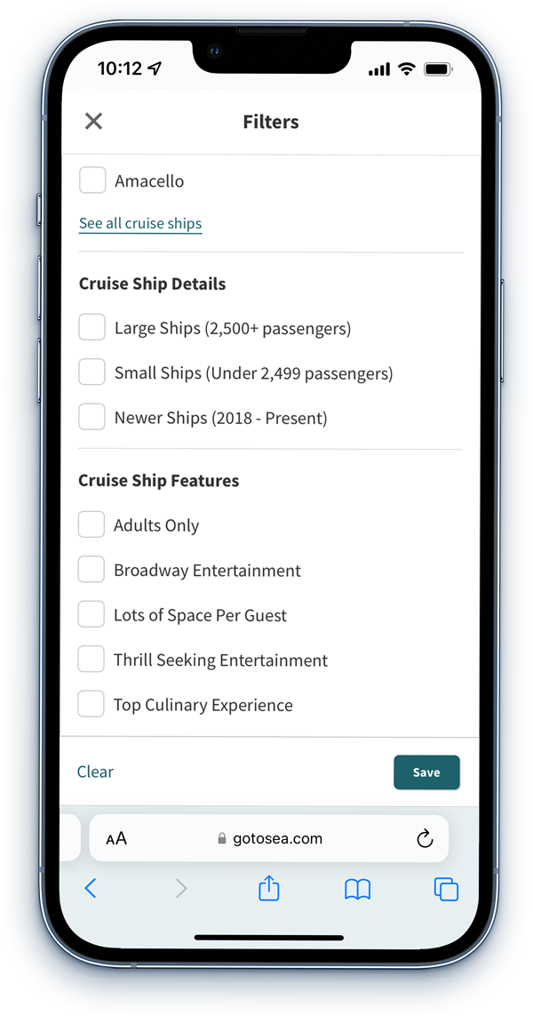
All filters (except for destination, dates, and depature ports) are combined into one modal. Users can make all their sections at once and see their selections at the top of the modal.
3. Flexible design
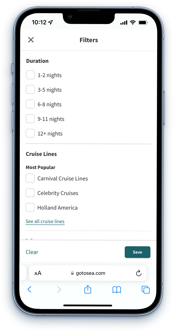
Because all the filters are in one modal, new filter options can be easily added. In the previous design, we would have to keep adding a new chip button which became lengthy on mobile screens.

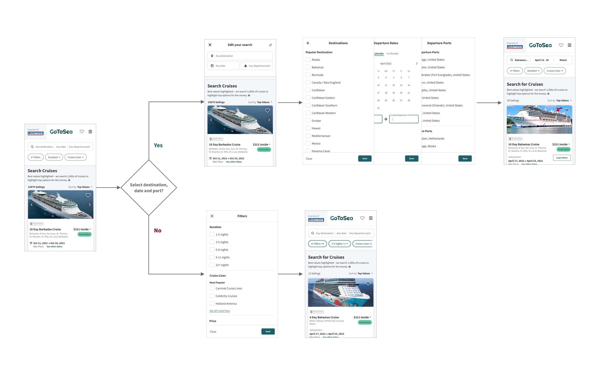
There are now two paths users can take to update their search results. 1: They can click on the search bar and update the most common filter types (destination, dates and port) or 2: They can select the visible filters (duration and cruise lines) or select the filter button opening up a modal with all filter types. Users can quickly make changes to either of these when searching for cruises.

TESTING
Uncovering problems
After the filters were put into staging, I began user testing the filters against our competitors. Overall, users preferred GoToSea's filtering process. However, there were still changes that needed to be made:
- Problem: The largest issue I found is that users were not seeing the new destination/port/date input field on the top of the search page. The filter nuggets were drawing user attention rather than the most important search features.
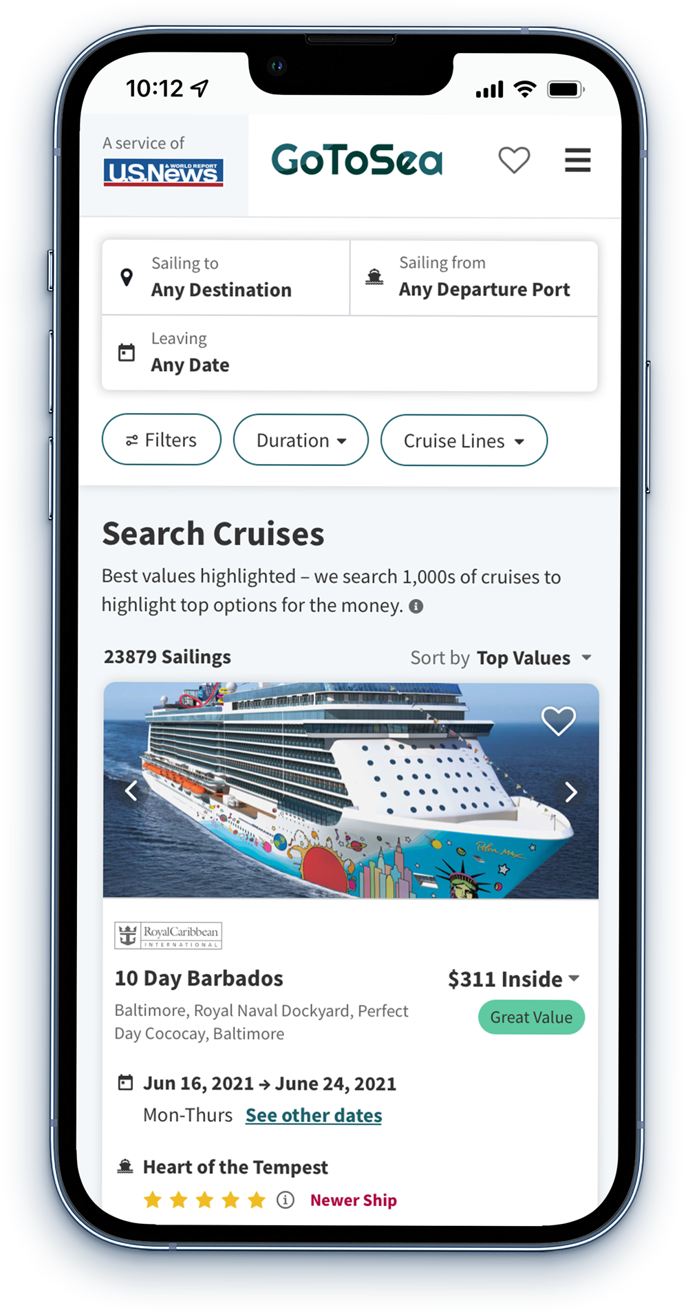
Solution: I decided to redesign the mobile search feature. I gave it more prominence by increasing the size and improving labels. After this change was made users had no trouble locating the search inputs and were able to quickly update the inputs as needed. - Problem: In my original, users made their destination, date, and port selections and then had to click the search button to update the filters. It was not immediately apparent to all users that they needed to click the search button for new search results to populate.
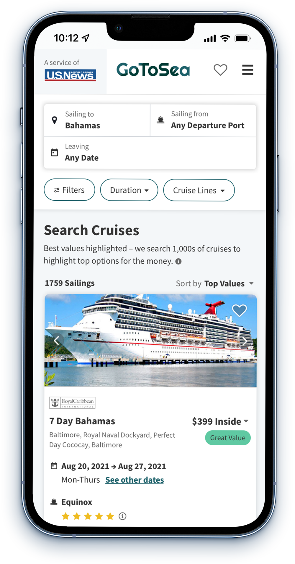
Solution: In my updated design, after a user makes a selection, the search results update—I removed the search button from the small breakpoint, but it kept it in the large breakpoint. The search button in the large breakpoint helped make the text inputs stand out and can be used to refresh the search. - Problem: Users wanted the ability to select more flexible departure dates, rather than selected specific dates.
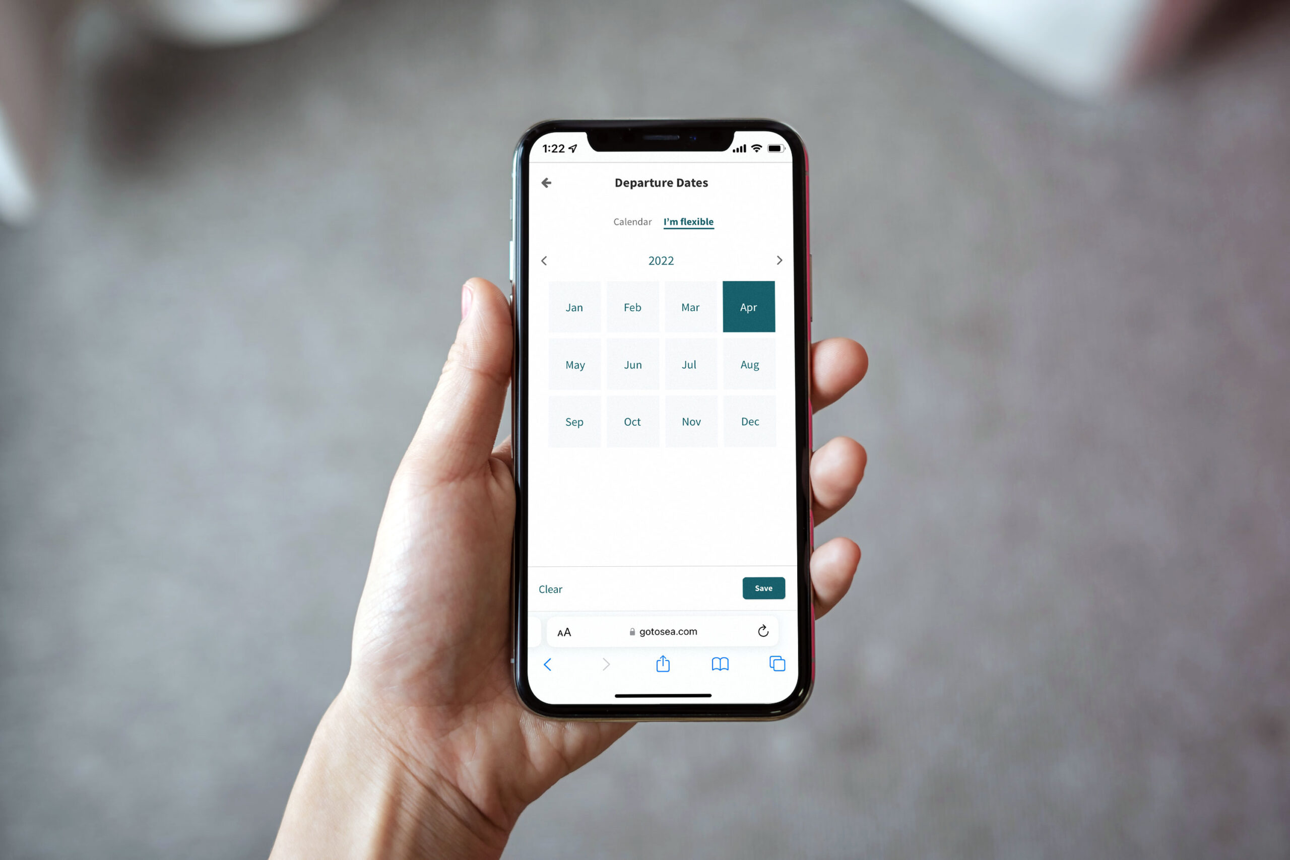
Solution: Add a flexible date option that allows users to select departure months instead of dates. (Note: this was not able to be included in the MVP and will be released at a later time).
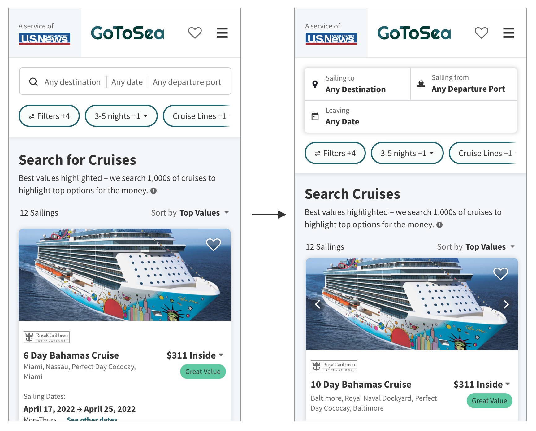

New mobile search inputs after testing
THE SOLUTION
A more efficient way to search and filter
Improved search feature
In user research, I saw a need to pull out the most common filter options into their own search bar. Users are now able to select destination, dates, and departure ports at the top of the page rather than click within the chip buttons. This change makes it easier for users to select these options and then dig deeper into other specific filters to narrow down their search.




Combined filter modal
One of the biggest pain points of the previous filter design was that users had to click and open multiple different modals to make their filter selections. Users now have the ability to view all filters in one modal and effortlessly make their selections. I also added a new "Your Selections" summary at the top of the modal so users are able to get an overview of their selections, as well as quickly delete and change filters as needed.




New filter options
With the new design we can now simply add new filter options anywhere within the new filter modal. Previously, a new chip button would need to be added—again increasing the time the user must take to apply filter selections.
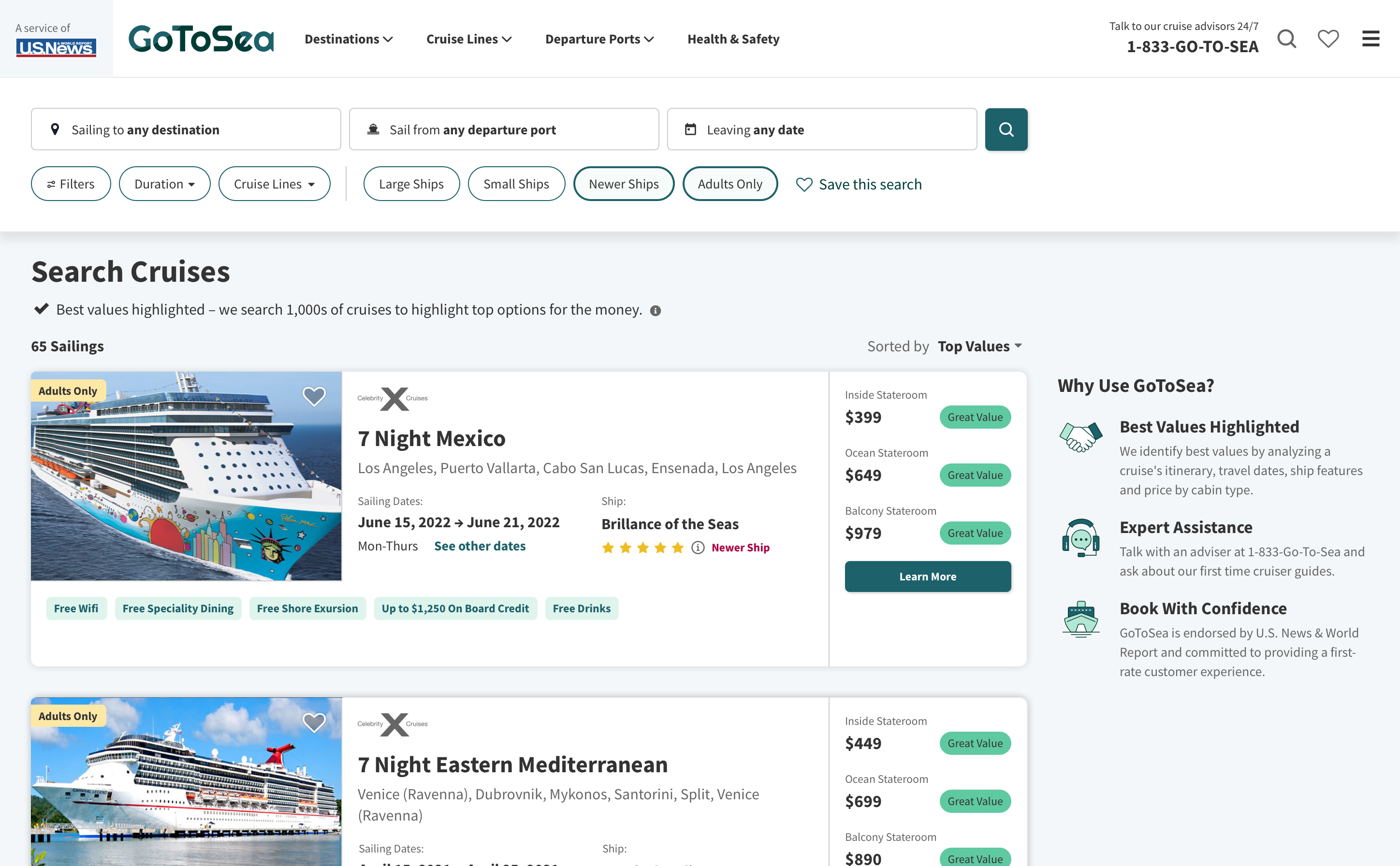
On deskop, I have also added new click select filter options, like Adults Only, Large Ships, Newer Ships, etc. We will continue to optimize these options to see what is most valuable to users.
In the future we will be adding fun new filters such as, Broadway Entertainment, Top Culinary Experience, Waterparks and more. These new additions will continue to add more value to the user and differentiate us from our competitors.



CONCLUSION
What I would have done different
Because I was the only person working on this redesign, there were limited resources as far as research and testing. If I had more time I would have loved to complete user interviews and implement some A/B testing as soon as the filters went into production.
User interviews
Though I had the data from our filter usage as well as some unmoderated user testing, I would have been helpful to talk to both new and experienced cruisers as to what is most important to them when searching for a cruise. More first person experience would've further improved the new filters.
A/B testing
Due to limited resources for A/B testing, I wasn't able to implement some small tweaks that would've helped optimize performamce. We do plan on A/B testing in the upcoming months, but if I were to redo this project I would have liked to line A/B testing up closer to production.
Results
Since the new filters have been in production, use of all filters has increased along with a 20% improvement in users making it to the checkout page. We will continue to monitor the filter usage and adjust the designs as needed. I also begin a new round of user testing to gather overall sentiment on the filters compared to our competitors.
Next Steps
We are in the processes of cleaning up a few bugs found and those should be resolved in the next few weeks.
In the upcoming month we will begin development on the flexible departure date feature. Research has shown users now have more flexibility when traveling and we want GoToSea to reflect that new lifestyle change.
We also hope to add more unique cruise ship features as we continue to gather more data of what users want in a cruise experience.

Thanks for stopping by, let's chat!
