CASE STUDY
National Park Service:
Rethinking Reservations

Planning a camping trip to a National Park can be overwhelming, this is amplified by the confusing interface currently being used by the National Park Service. The goal of this project was to alleviate the pain point of navigating camping information and making reservations on the National Parks Service's website—by streamlining information, creating a clear information architecture and improving content hierarchy. For the sake of this project we focused on Yosemite National Park.
Our solution was to redesign the camping reservation page in a clear way, reorganize the IA and create a new page to act as a central hub for all camping resources.
Note: Though this was a concept project we approached it as a real world project.
ROLE:
User Experience & Interface Design, User Research
TEAM:
Keegan Brown
Michaela Griswold
Marykate Scrobe
Sinead Willis
TOOLS USED:
Figma, Illustrator, Photoshop
DURATION:
14 days
BACKGROUND
The National Park Service website is the go to resource when learning about a park or making a reservation. It is always within the first 2-3 google results when searching for a park or camping reservations.
The National Park Service currently has 63 parks across the United States and each park landing page(s) has a different layout, navigation and varying detail.
Making reservations for parks is not done on the actual National Parks website, but through a 3rd party site, Recreation.gov. This is not made apparent on the current site and we saw it as a potential major pain point for users.
RESEARCH
Understanding the
user's experience
Research Methods: 10 interviews, 10 usability tests and industry trend reports
Interviews
To understand the pain points that users experience when landing on the camping reservations page, a thorough interview plan was written out to gain insight on potential campers. We wanted to learn more about our interviewees':
- General experience planning camping trips online.
- What is important to them when planning a trip.
- Experience with the current National Parks Service website.

Usability Testing
In order to gain insight on the challenges users face when navigating reservation information we conducted 7 usability tests with our interviewees.
Users were asked how they would go about making a reservation at Yosemite National Park.
- 0% of users were able to find where to make a reservation with no mistakes
- 57% of users made 2+ mistakes when navigating the reservation process
- 100% of users were confused at where they were supposed to go
Key Insights
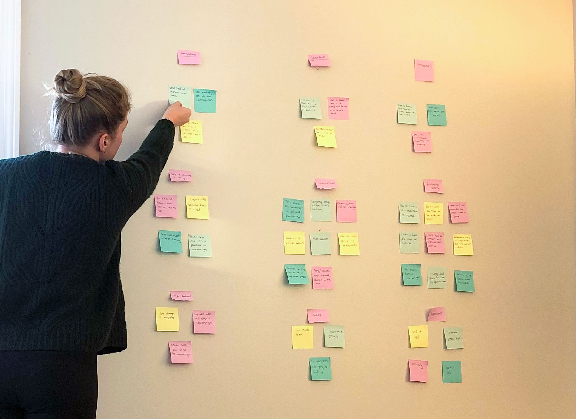
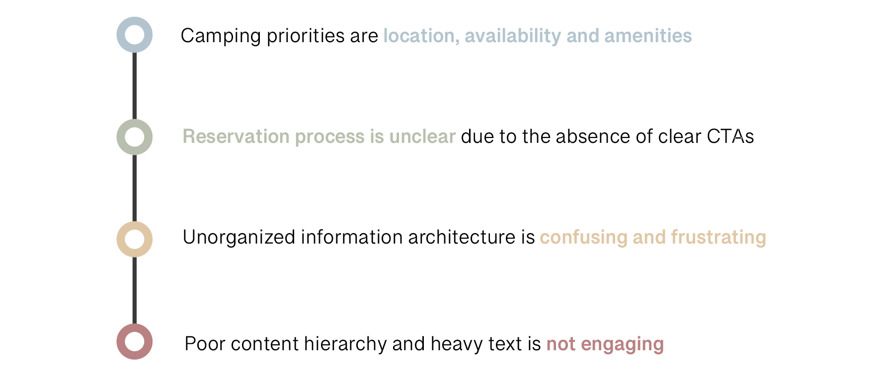
After interviews and usability tests of the current site—it was clear users were unable to find the campground and reservation information they needed. As we hypothesized, users were left feeling frustrated due to lack of CTAS, unorganized information architecture and poor content hierarchy.
The text heavy pages were not engaging and hard to skim making it impossible for users to quickly find the information they needed to make a reservation.
Unclear Call to Action
"I thought reserving would be on the Yosemite home page, but then the “Reserve” button doesn’t have anything to do with reserving a campsite. This is very confusing"
Redirect Confusion
"I didn’t like how it redirected me to another site with more information. Why is that necessary?
Not Intuitive
"Things I clicked that I thought were obvious didn't take me to the right place. I questioned myself, what am I missing."
DEFINE
Identifying the user & mapping the journey
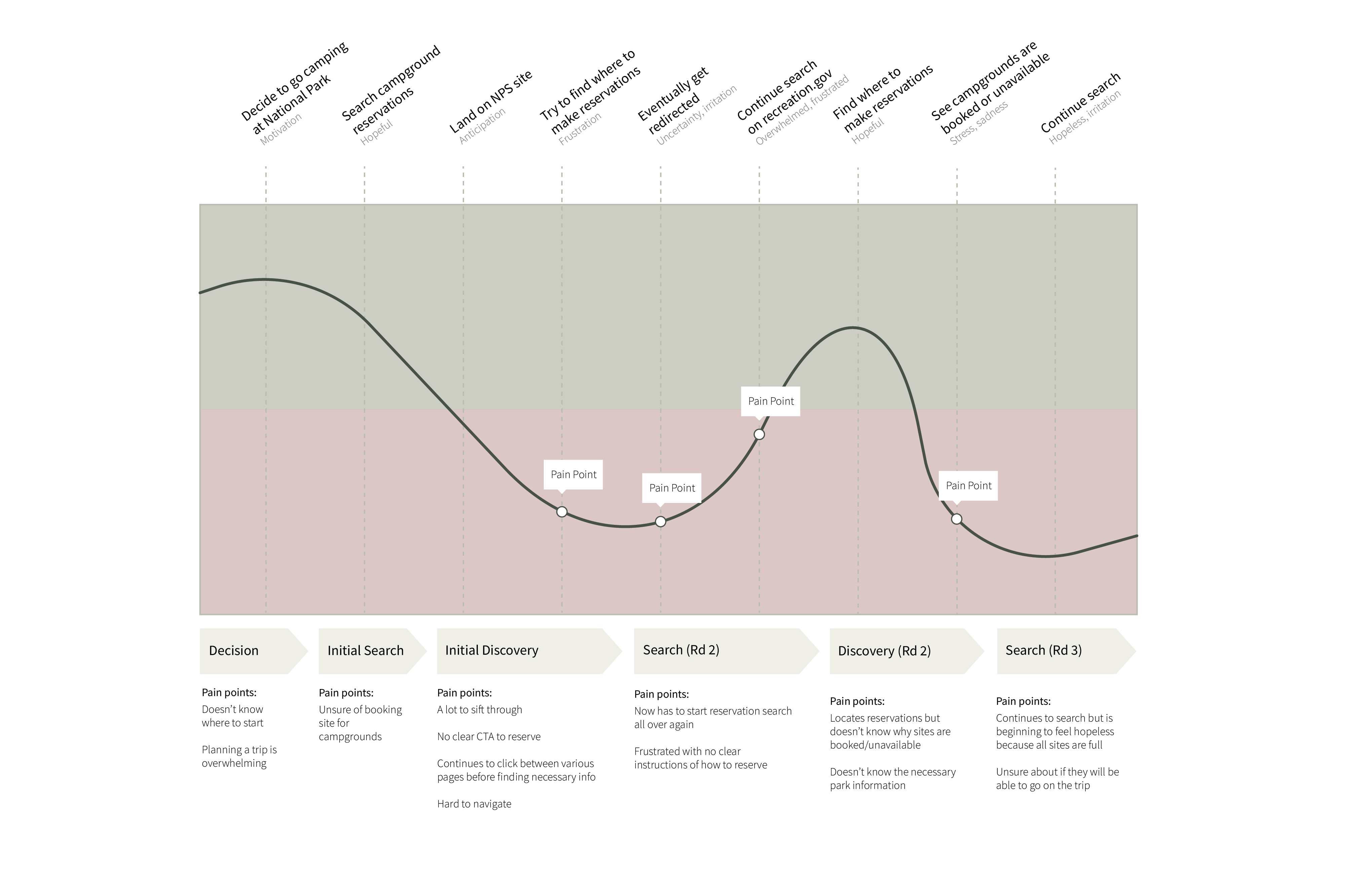
With the research gathered from interviews and camping trend reports, a user persona was created to help guide our design decisions to ensure that the user’s needs were always met. Savannah Hart is a 36 year old mother of 2 who enjoys camping getaways and likes to plan ahead. She has never camped at a national park so she is looking for quick information on parks and to make a reservation based on her research.
PROBLEM
Text heavy, lack of content organization and CTAs, overloaded with information—the current National Parks site is confusing to users. Users need an intuitive, informative way to learn about national parks so that they can stay organized, plan ahead and book campsites with confidence.
JOURNEY MAP
Making a campground reservation at a national park

USERFLOW
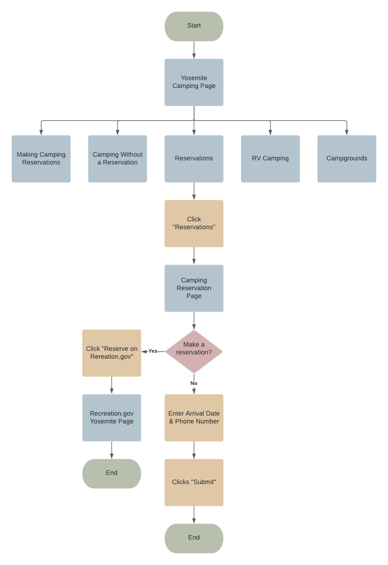
New user journey
To cater to the demographic of users, simplicity was our first priority. We took away the clunky layered navigation by allowing users to go straight to the camping page to see all information organized clearly. We also made CTAs clear and created content hierarchy on the reservations. Our user flow was built to ensure intuitive actions and straight forward accessibility.
SOLUTION
How might we arrange campsite reservation information to prioritize planning tips such as booking date constraints, and allow for a seamless transition to a third-party booking service?
IDEATION
Designing a new solution
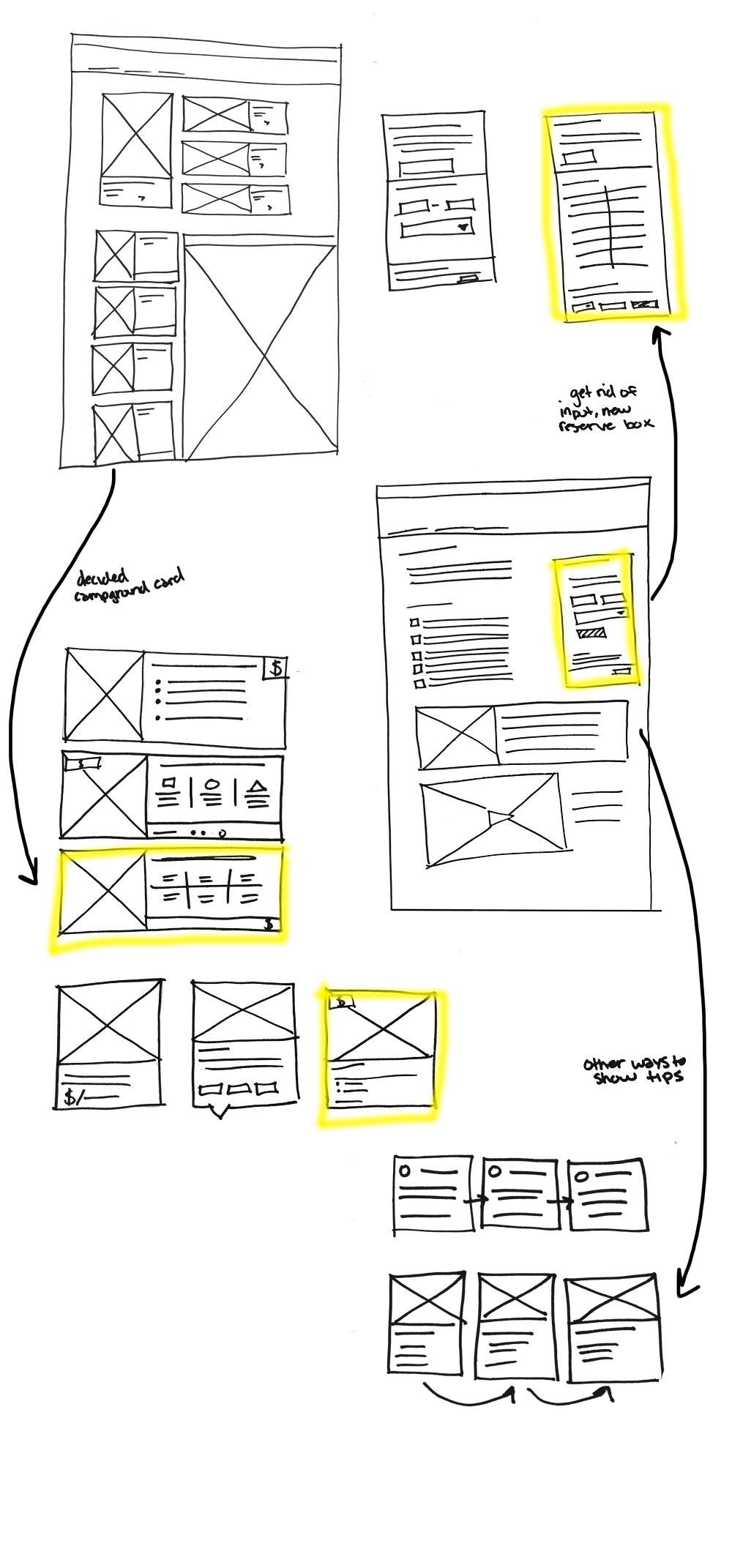
Using the knowledge we gained from our research we began to sketch.
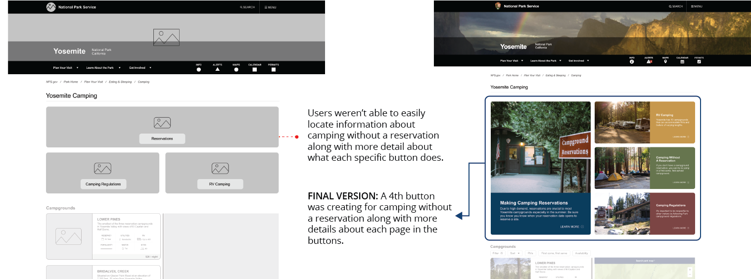
- We knew we needed a new landing page for all camping links to be accessible. This page included links to: reservations, RV camping, camping without a reservation, camping regulations and campground information.
- Based on our interviews—location of campsites are an important factor so we knew we needed a dynamic map feature along with quick facts about each campground.
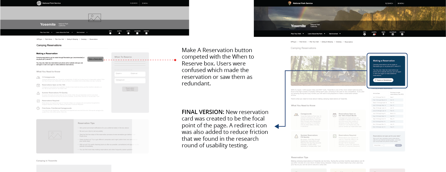
- Because 100% of our users were confused about the reservations process, our designs focused on a clear CTA for the reservations page.
- Nearly all interviewees didn't bother to scroll to see any additional information for reservations—our designs needed to engage the user as the information provided was vital to a successful reservation.
- Navigation needed to be simplified, we consolidated all camping dropdown menu options under "Camping" to avoid confusion for the user.
DEVELOPMENT & TESTING
Design, test, iterate, repeat
We put our initial designs to the test by observing how easily participants were able to navigate through the new camping and reservations page with three given scenarios in our low fidelity prototypes.
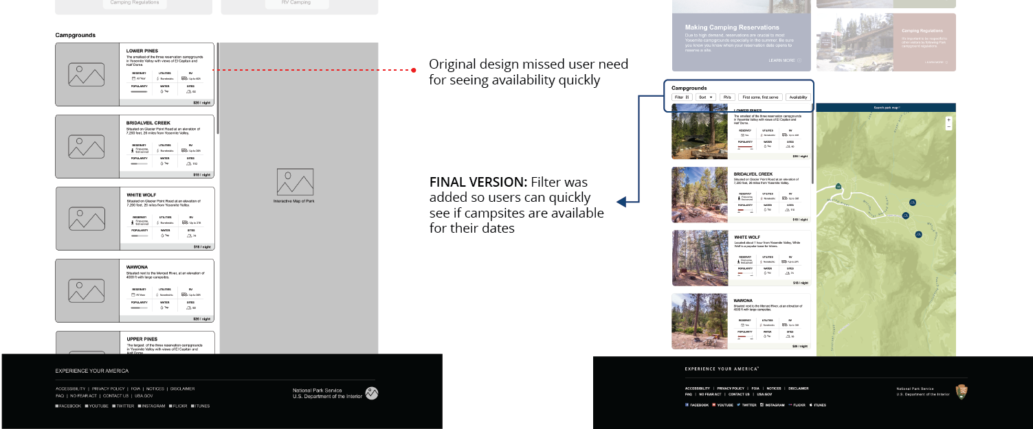
- Find what campgrounds are available for the dates of your trip
- Make a camping reservation for your trip
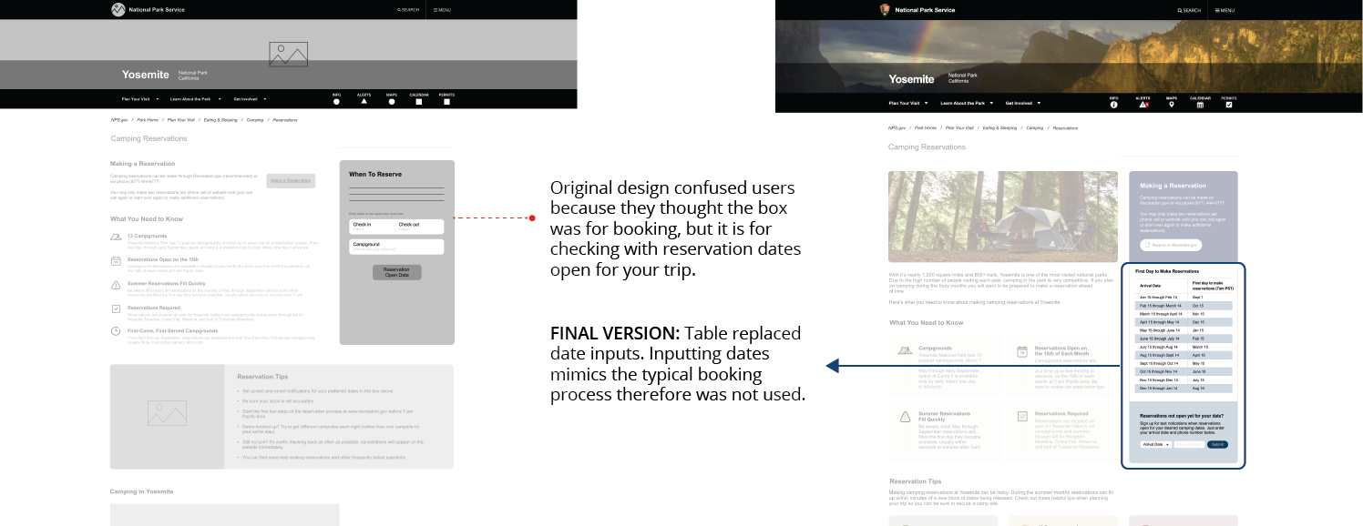
- Set up a reminder for your camping reservation
Usability Testing Feedback
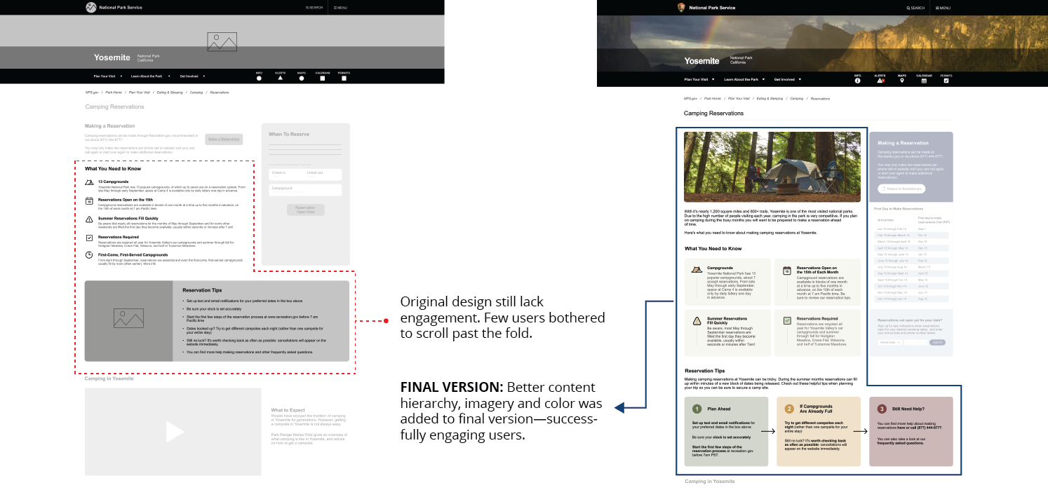
TESTING RESULTS
After 4 rounds of testing, 100% of users were able to find where to make a reservation without any mistakes in a matter in seconds (decreased time by over a minute). 100% of users were also able to find availability and set up texting reminders. All confusion of the site redirect was also removed. Overall, users experienced no frustration in finding information and were satisfied with their experience.
THE SOLUTION
A redesigned camping and reservations page integrating our user's needed features
Explore the final prototype and see key features in action below. Users can now:
- See campgrounds on a dynamic map
- Check campsite availability for their trip dates
- Easily find where to make reservations
- Set up text reminders for when their reservation dates open.
- New, simplified navigation
FINAL PROTOTYPE
FEATURES IN ACTION
Dynamic Map
Click slider to see before
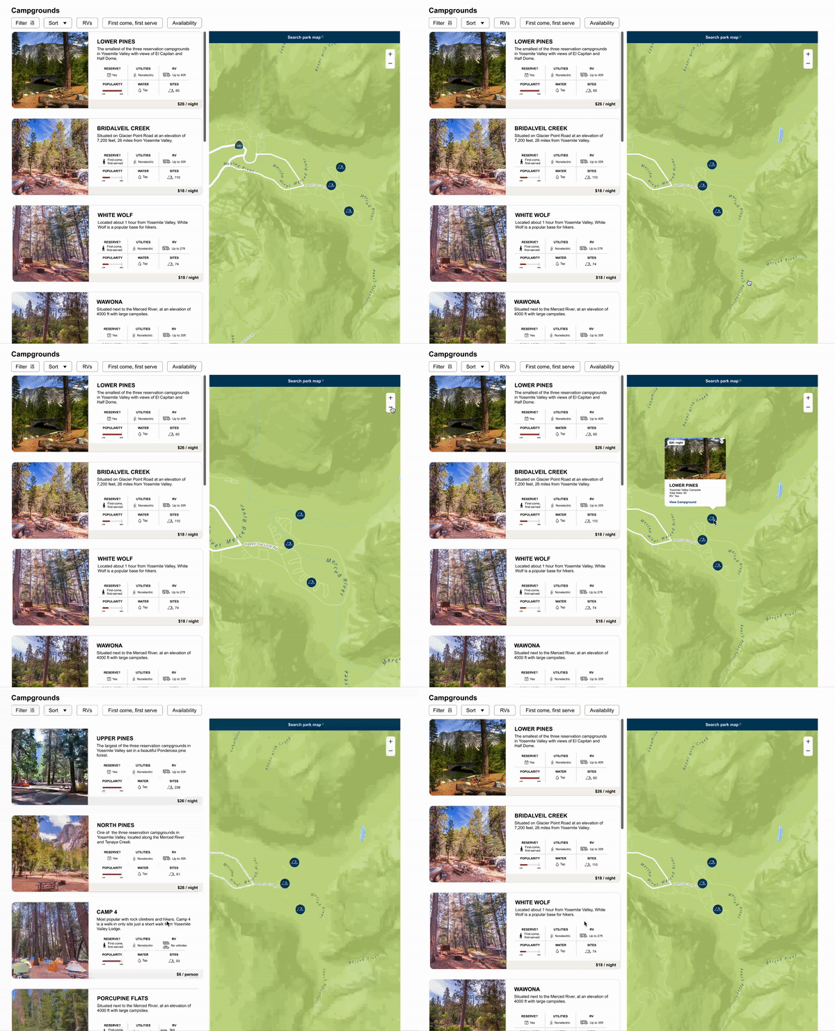
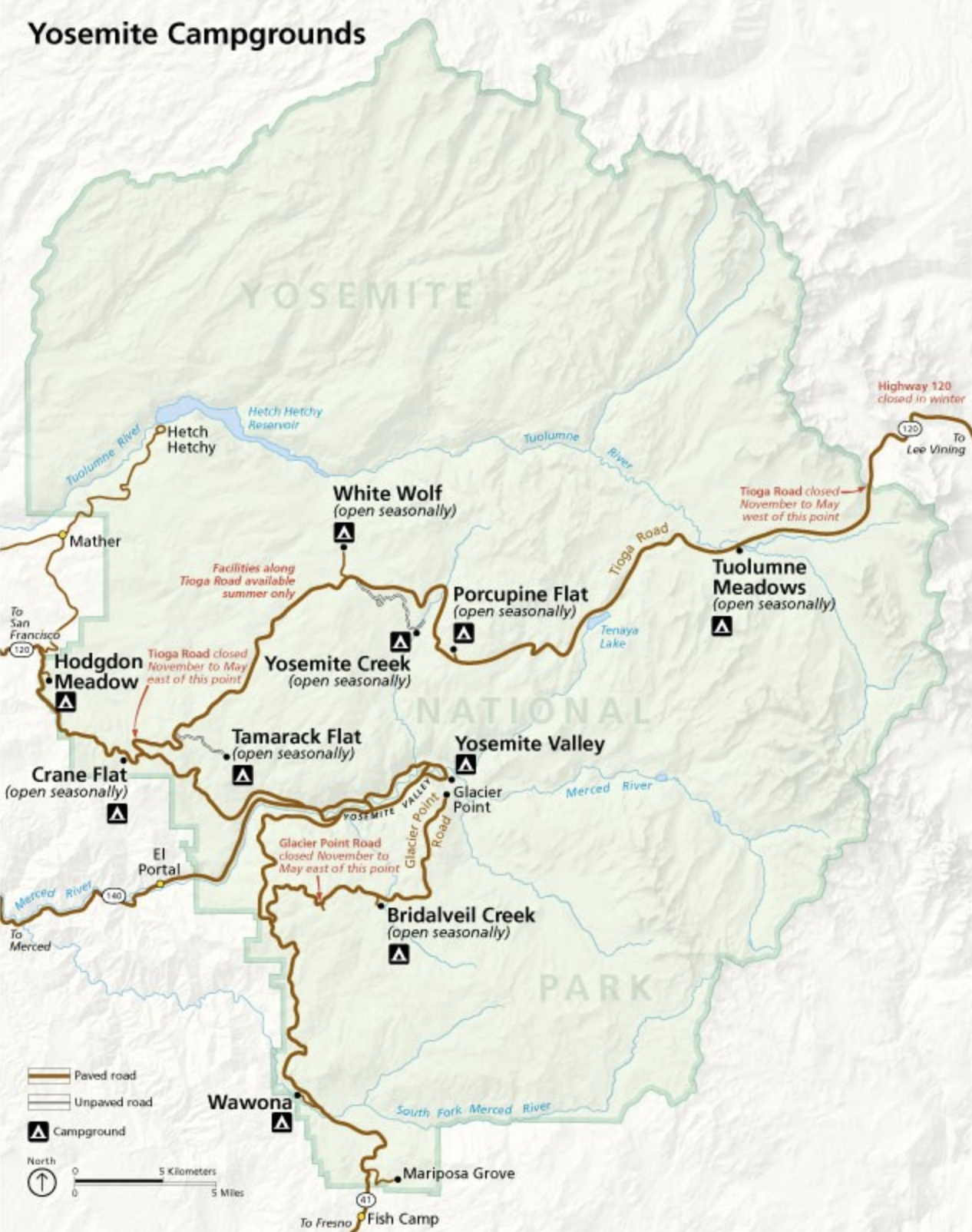
HOW DOES IT MEET USERS' NEEDS?
Research shows campsite location as a high priority for users when planning a trip.
New map feature allows users to search the park area to see where campgrounds are and help them decide which campground best fits their needs.
FEATURES IN ACTION
Filter Campgrounds
HOW DOES IT MEET USERS' NEEDS?
Interviews revealed knowing campground availability is crucial when searching for a site. Previously this info was only available once redirected to recreation.gov, a pain point for users.
Users are now able to filter and sort campgrounds—and more importantly see which campgrounds are available for their dates before being redirected to recreation.gov.
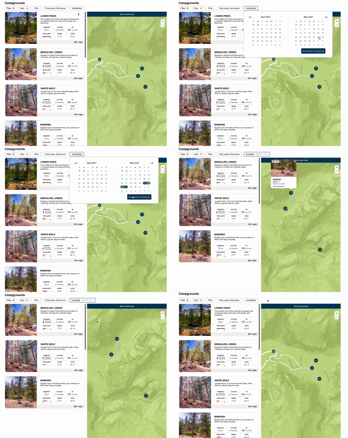
FEATURES IN ACTION
Clear Reservation Process
Click slider to see before
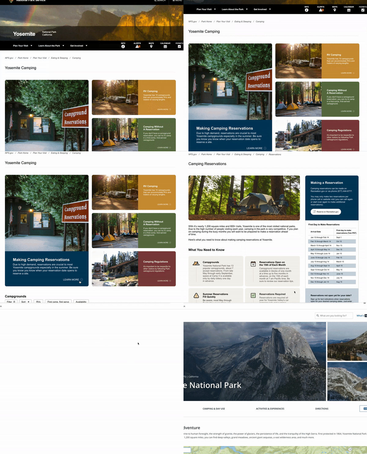
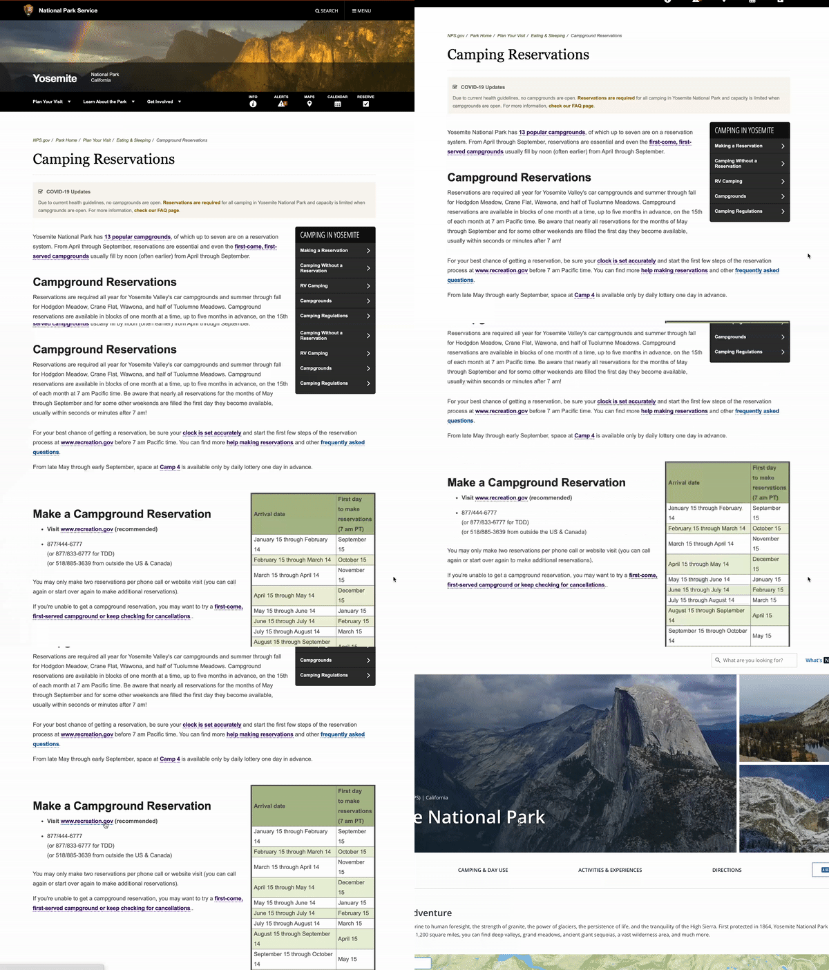
HOW DOES IT MEET USERS' NEEDS?
During research 100% of users were unable to find where to make a reservation without any mistakes. Additionally, users were unaware they were going to be redirected to recreation.gov.
The new reservation page features a simple button to direct users to recreation.gov where they can reserve their campsite—it's no longer hidden amongst a sea of text. A new redirect icon on the button eliminates confusion.
FEATURES IN ACTION
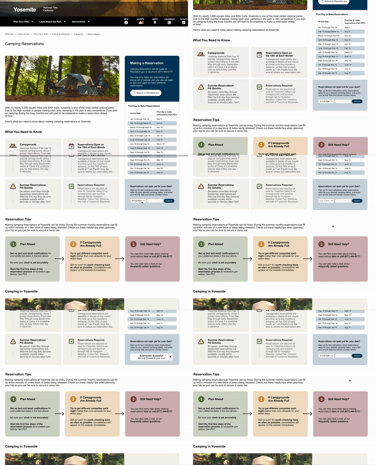
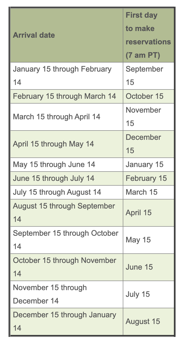
Text Reminder
HOW DOES IT MEET USERS' NEEDS?
Research showed user frustration when unable to reserve a campsite for their given dates.
Due to campgrounds filling up within minutes of being released, users now can set up text reminders for when their reservation dates open so they'll never miss the opportunity for a campsite again.
Click slider to see before
FEATURES IN ACTION
Simplified Navigation
Click slider to see before
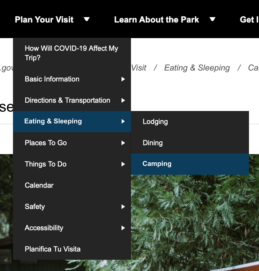
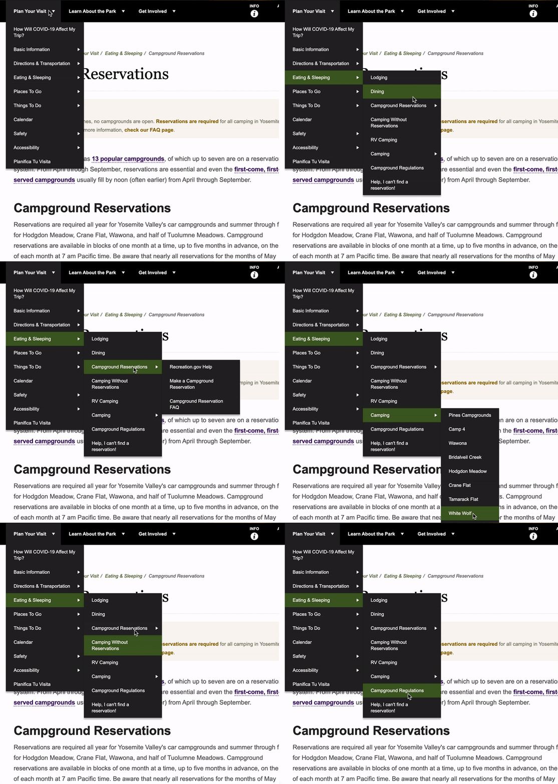
HOW DOES IT MEET USERS' NEEDS?
Nearly 100% of interviewed users were confused by the layered and unclear navigation.
A new simplified navigation was created, removing the layers and letting the camping page lead to all necessary links.
CONCLUSION
Reflection & Learnings
I AM NOT THE USER
At the start of this project our team thought we had a good idea of what user needs were. Some of us were avid campers and had a preset vision on the solution. However, after research and testing we were proven wrong and had to pivot at times.
ITERATE, ITERATE, ITERATE
Usability testing and iterations are truly the key to success. After we built our low-fidelity prototype we thought the users would have no problems, that was not the case. We continued to test new ideas and eventually landed on one that all users could use successfully.
SIMPLICITY IS KING
Sometimes simpler is better. There were times we wanted to implement "fancier" features that we thought would bring more benefits to the user. In the end, the simpler design was the winner for users.
