CASE STUDY
GoToSea: Designing a better checkout experience


The online cruise booking process can be a confusing one, especially for new cruise goers. Often, cruise aggregator sites are busy, hard to navigate, and frustrating to use. U.S. News & World Report saw a need for a new type of cruise aggregator site, one that puts the customer first and helps streamline the process. GoToSea launched in 2020 and slowly we have transformed an out of the box cruise booking engine into a customized, tested, and research-backed booking process..
ROLE:
User Experience & Interface Design, User Research
TOOLS USED:
Sketch, Illustrator, Photoshop
DURATION:
4 Months
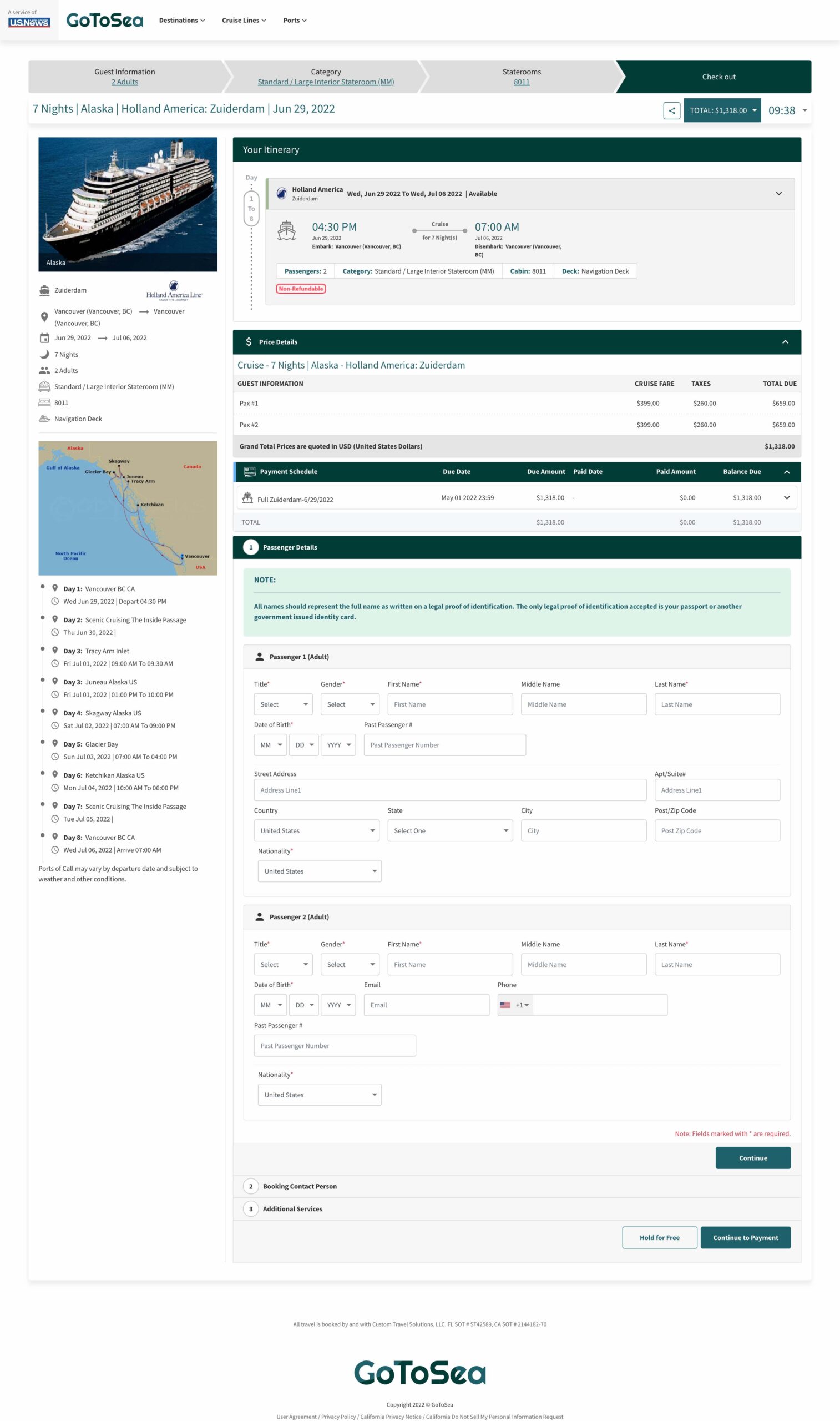
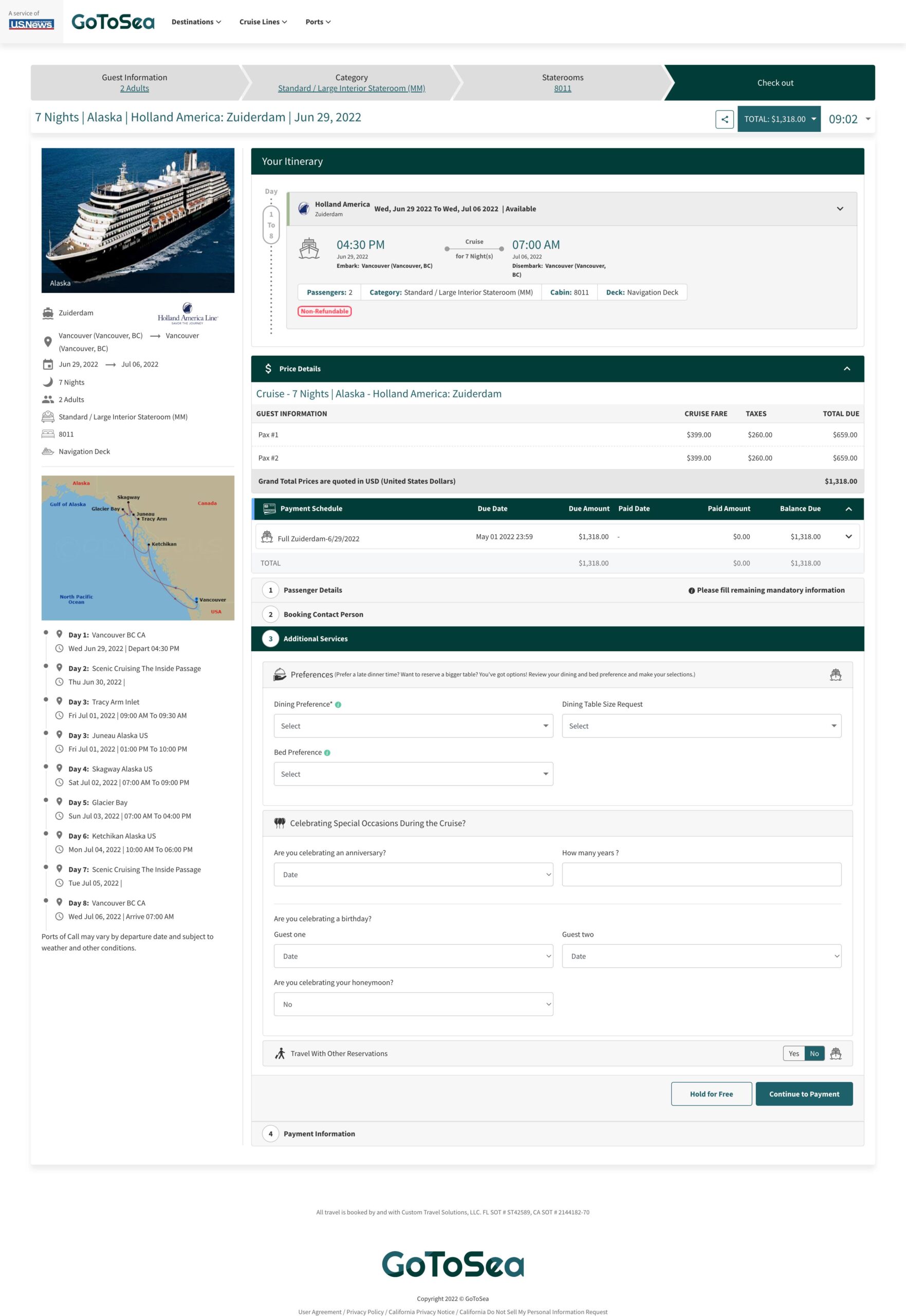
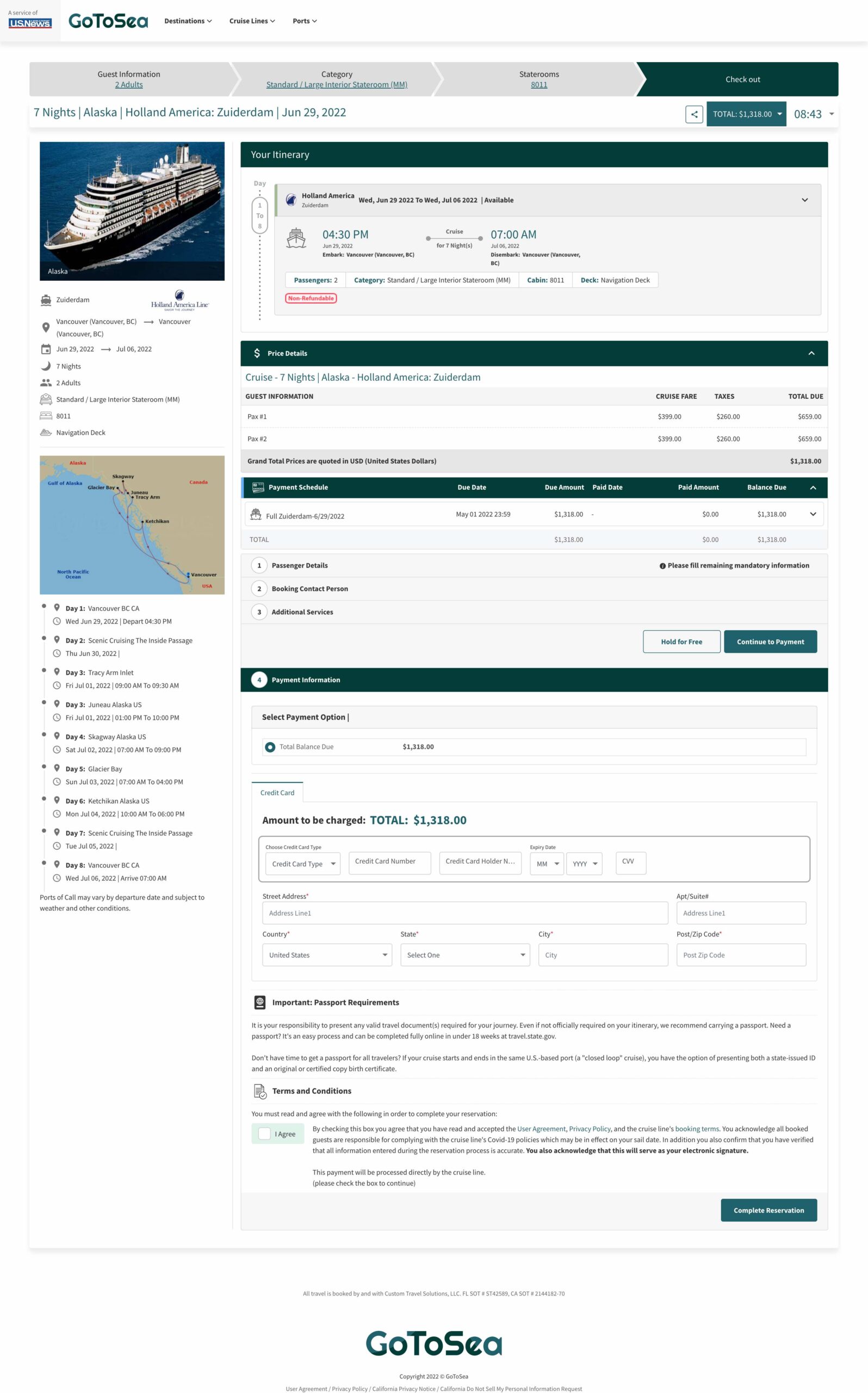
Old checkout design
BACKGROUND
Understanding the goal
GoToSea launched with a MVP booking flow provided by a 3rd party booking company. However, these designs were overwhelming, challenging to use and did not have users in mind. Conversions rates were under 0.2%, half the national average—we wanted to double conversions after launch.
I was tasked with creating the new checkout pages for GoToSea. I completed the end-to-end designs—starting with research and ending with high-fidelity mocks which were handed off to our 3rd party booking partner to implement.
Working within tech limitations
Because we were working with a 3rd party partner and had a set budget, I was limited to working within a similar layout to the old checkout design. Therefore, I focused on simplifying each step and giving users a clear path to booking a cruise.
RESEARCH
Discovering users' needs
To better understand the competitive landscape and pain points with the current checkout pages, I completed the following:
Competitive Analysis
Researched 6+ cruise sites’ booking flow. I analyzed and compared their overall design, number and length of steps to complete the booking, payment options, and usability. After the analysis, I determined we had a lot of improvements to make, especially in guiding the user through the process more clearly and minimizing the amount of fields/buttons/options users need to complete.
User Testing
Conducted an unmoderated user test where users compared the GoToSea booking flow to 4 other competitors. Users struggled to find information easily and lengthy form fields kept some users from completing the tasks quickly.
Data
Analyzed data from the booking flow, specifically at conversion rates, where users are dropping off and number of users who return to complete a booking after placing a hold.
Other External Research
Reviewed case studies, design patterns, and guidelines for booking sites and e-commerce sites.
Key Insights:
01 Lack of definite steps—the checkout page had several calls to action and the immediate next step was not obvious.
02 Distracting and overwhelming—there were a lot of things to look at on the page, from itineraries to payment schedule to bonus offers. The focus of the page needed to be made clear.
03 Lengthy forms—though many of the input fields were necessary they were not laid out in a way for users to complete quickly.
04 Unclear price summary—information was disjointed and there was no obvious way to review the price breakdown and selections made.
05 Untrustworthy—specifically regarding credit card fields. Users did not trust their information was safe.
06 High drop-off rate—XX% of users drop off once they make it to payment.
Overwhelming
“I have no idea where to start. There are so many form fields and too much information. I don't want to spend the time looking through this all.”
Untrustworthy
“This site doesn't feel very trustworthy. Feels very different from the rest of the site”
Unclear
“What do I click next? I'm not sure what step I'm on. Wish there was a easy way to see what I'm supposed to do next. "
PROBLEM
GoToSea needs a new checkout process with concise steps, simplified design, and transparency around price in order to build customer confidence, improve drop-off rates, and increase conversion.
Identified opportunities
- Add a price summary step to outline prices and selections made in previous steps.
- Create clear seperate steps for each part of the checkout process: Review, Guest Details, Customize, and Payment.
- Design definite call-to-actions on each step allowing users to clearly see when one step ends and another begins.
- Reduce number of default input fields to streamline the checkout process.
- Only show "must need" information on each page to prevent overwhelming the user.
- Boost customer confidence with messaging and trust icons at the time of payment to increase conversions.
USER FLOWS
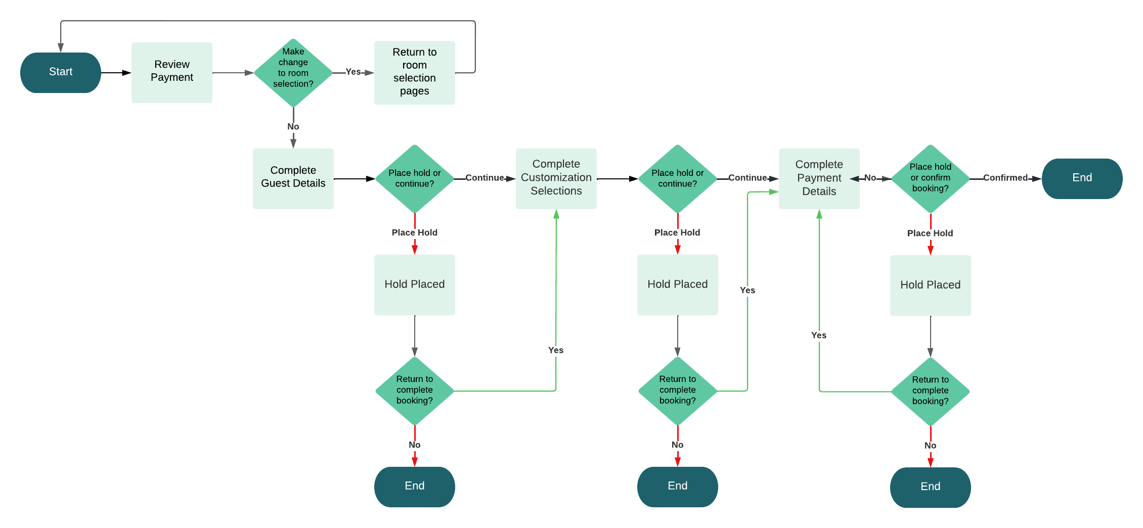
Simplified user journey
A user flow was created as reference when creating wireframes.
Note: This is a streamlined version of the user flow. Each cruise line has specific requirements so there many different variations depending on which cruiseline a user is booking.
SOLUTION
How might we help users quickly complete the checkout process while providing adequate information without overwhelming them with complex cruising details/jargon.
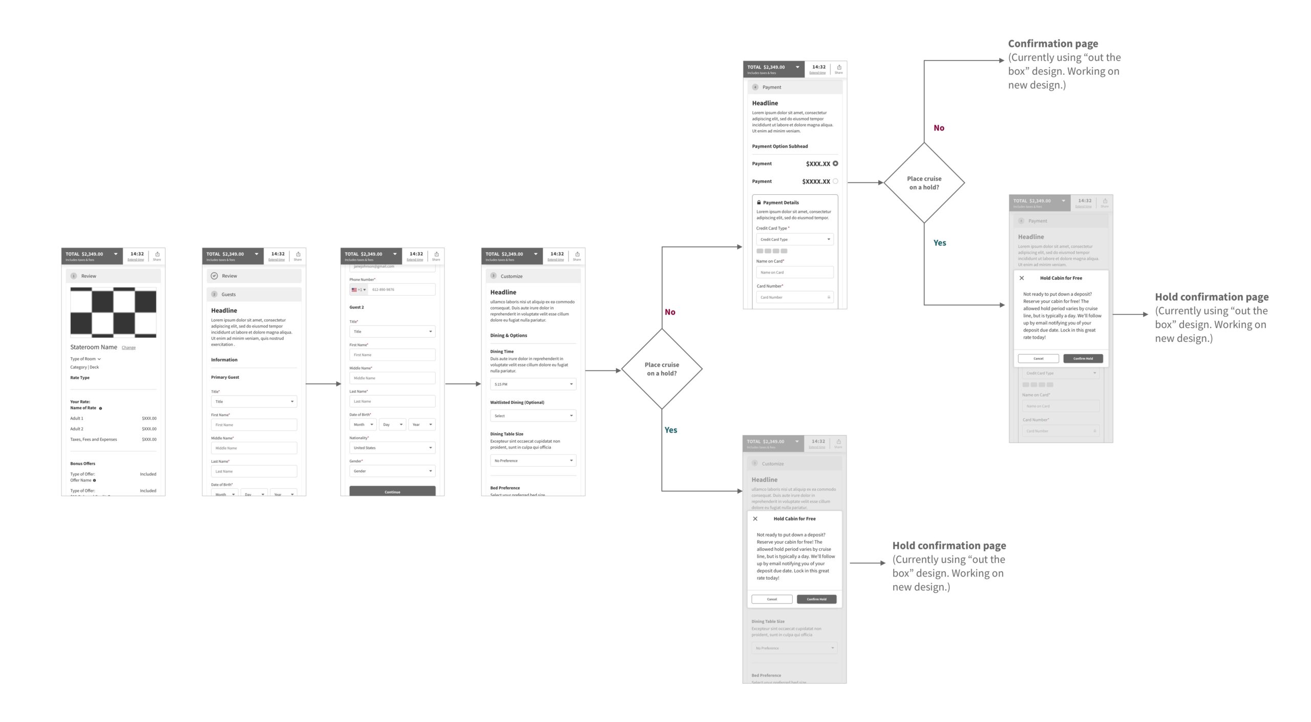
IDEATE
Designing the checkout new experience
Using the knowledge gained from research—I began to ideate using the existing framework from the checkout page.
1. Goals for Price Summary
• Transparent price breakdown—what fees are the fees and why are they added
• Quick to scan, since there are no action steps for users on this page I wanted it to be as as seamless as possible so users could move to the next step
2. Goals for Guest Details and Customization page
• Limit number of input fields, hiding fields when possible
• Simplify customization options and organizing them in a clearer way.
• The goal for both of these pages is to move the user through them as efficiently as possible
3. Goals for Payment page
• Secure messaging
• Clear payment options
• Summary of payment before completing booking
TESTING & REVIEWING
Back to the drawing board
I ran into a lot of development and design limitations after presenting my initial designs to our third party dev partner that I did not anticipate, therefore the designs had to be scaled back. I also conducted a few live user testing interviews as well as an unmoderated test.
Feedback from developers (3rd party cruise booking parter):
• Progress bar concept I initially designed wasn't possible to develop within budget so I had to go back to using an accordian design.
• There was much more variation between each cruise line than anticpiated. I had to go back to the drawing board to make designs more flexible to fit each cruise line's needs.
Feedback from users:
Overall, users loved how clean and organized the new checkout process was. Nearly all users said it was the most streamlined cruise booking they have used and said their trust in GoToSea increased as they completed teh booking process.
Pain Point: A couple user still thought the taxes and fees breakdown wasn't clear.
Solution: We will be adding a tool tip to show a further breakdown of fees.
Pain Point: Steps kept collapsing due to users double clicking because of slow load time.
Solution: We will be adding a loading state as a visual que so users know the next step will be loading soon.
Pain Point: How to place a hold was not clear enough.
Solution: We will be increasing the size of the hold text on the review step and will also be testing some options to add a hold button earlier in the process.
THE SOLUTION
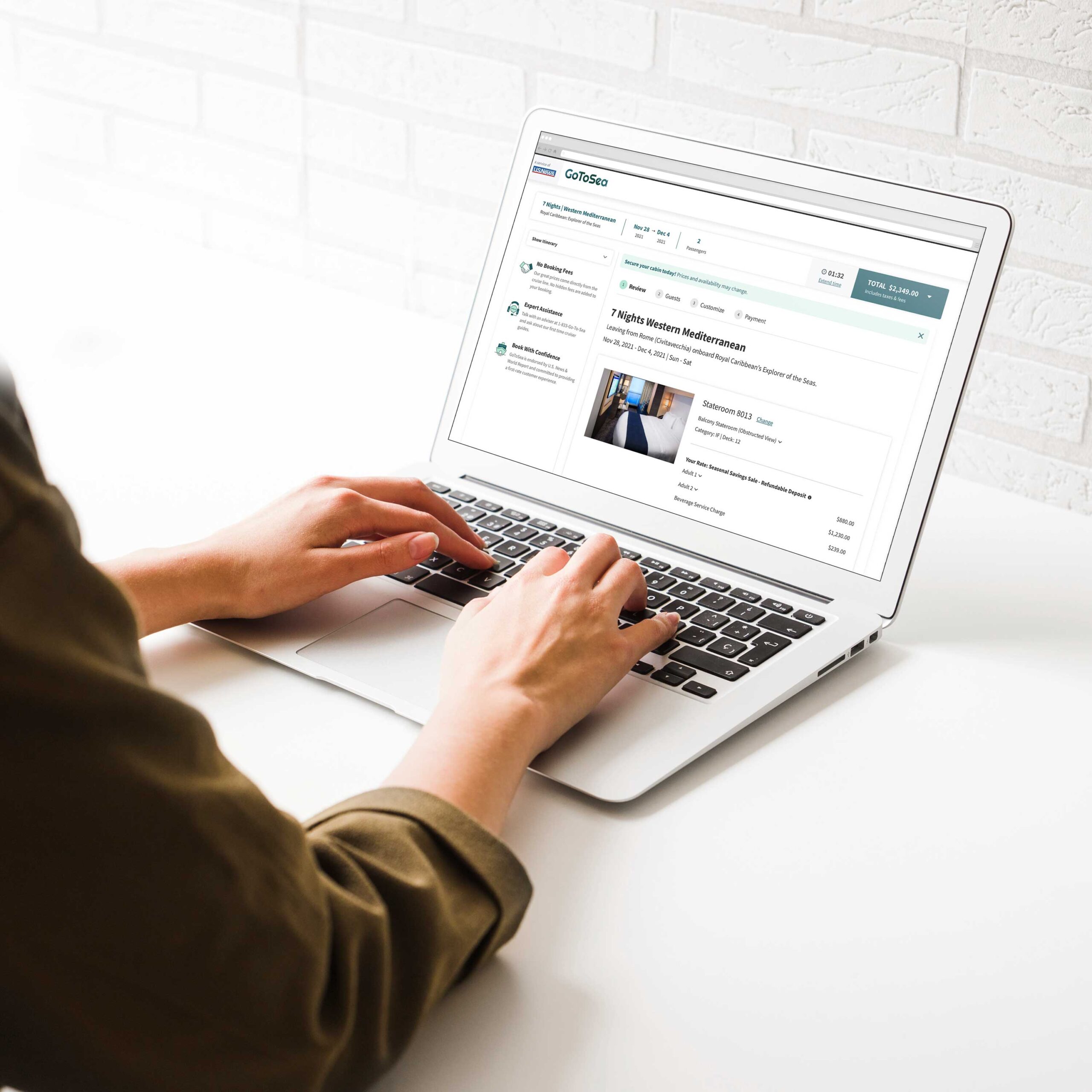
New and improved checkout process
Steps are now broken up more clearly, allowing users to quickly make selections without distractions.
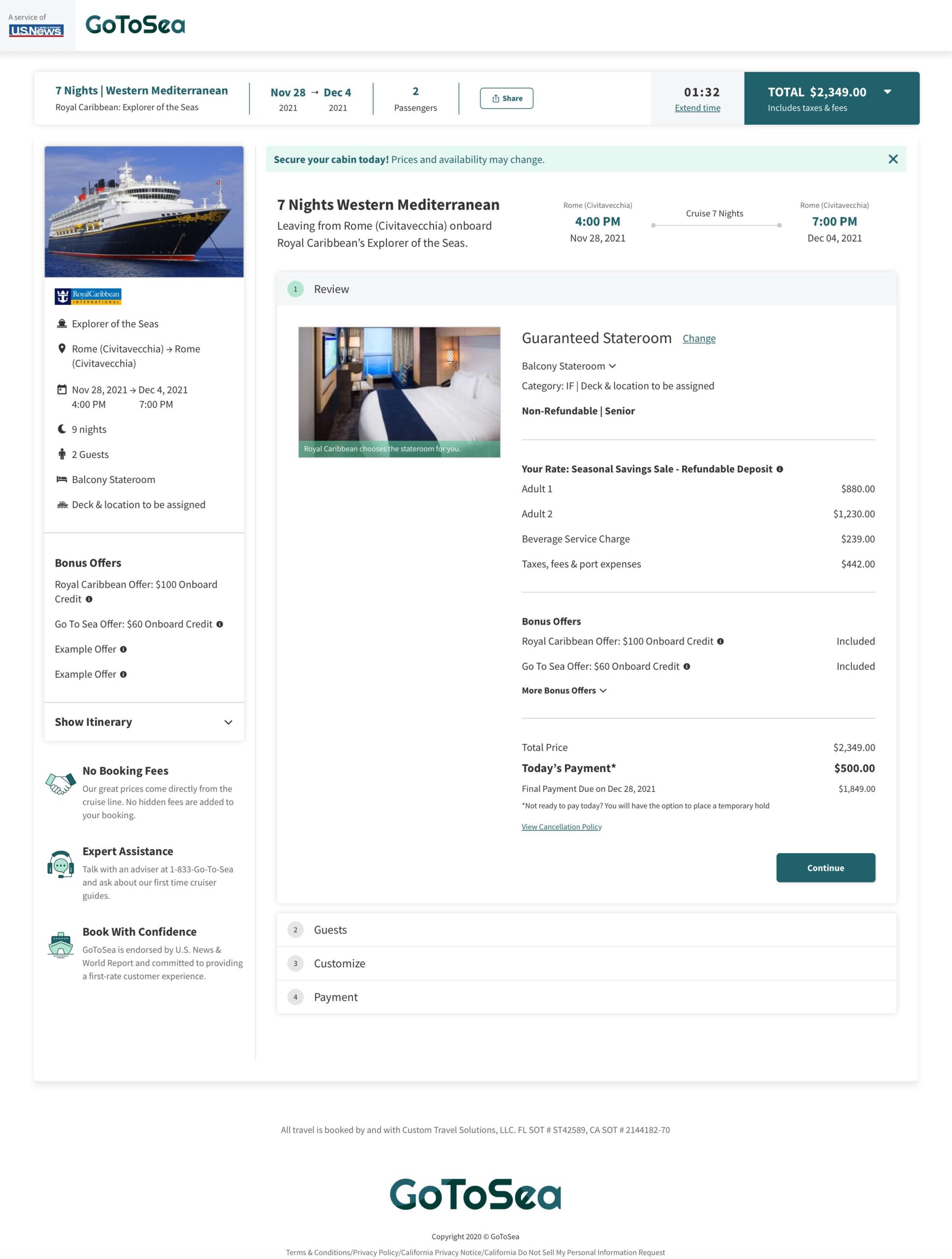
Price Summary
The old design exposed too many steps at once and pricing was not organized in an easily scannable way. The new design lists out all line items so users can swiftly see all their selections and the cost of each.
Guest Details
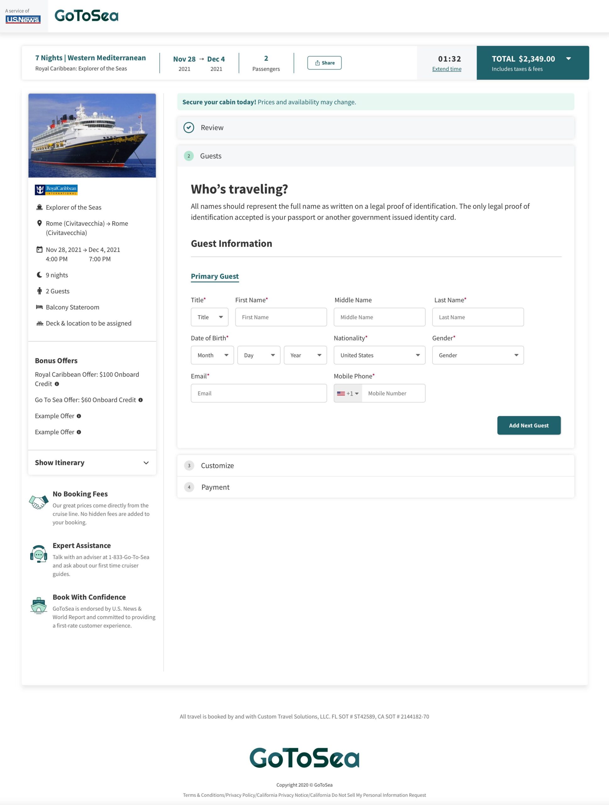
Unecessary form fields were removed, and the form fields we needed to keep have been reformatted to match common design patterns making it faster to complete. Additional guest form fields have been hidden until users choose to click "Add Next Guest". This helps user not feel overwhelmed by the amount of information that needs to be completed.
View Small Breakpoint (Guest 1)
View Large Breakpoint (Guest 1)
View Small Breakpoint (Guest 2)
View Large Breakpoint (Guest 2)
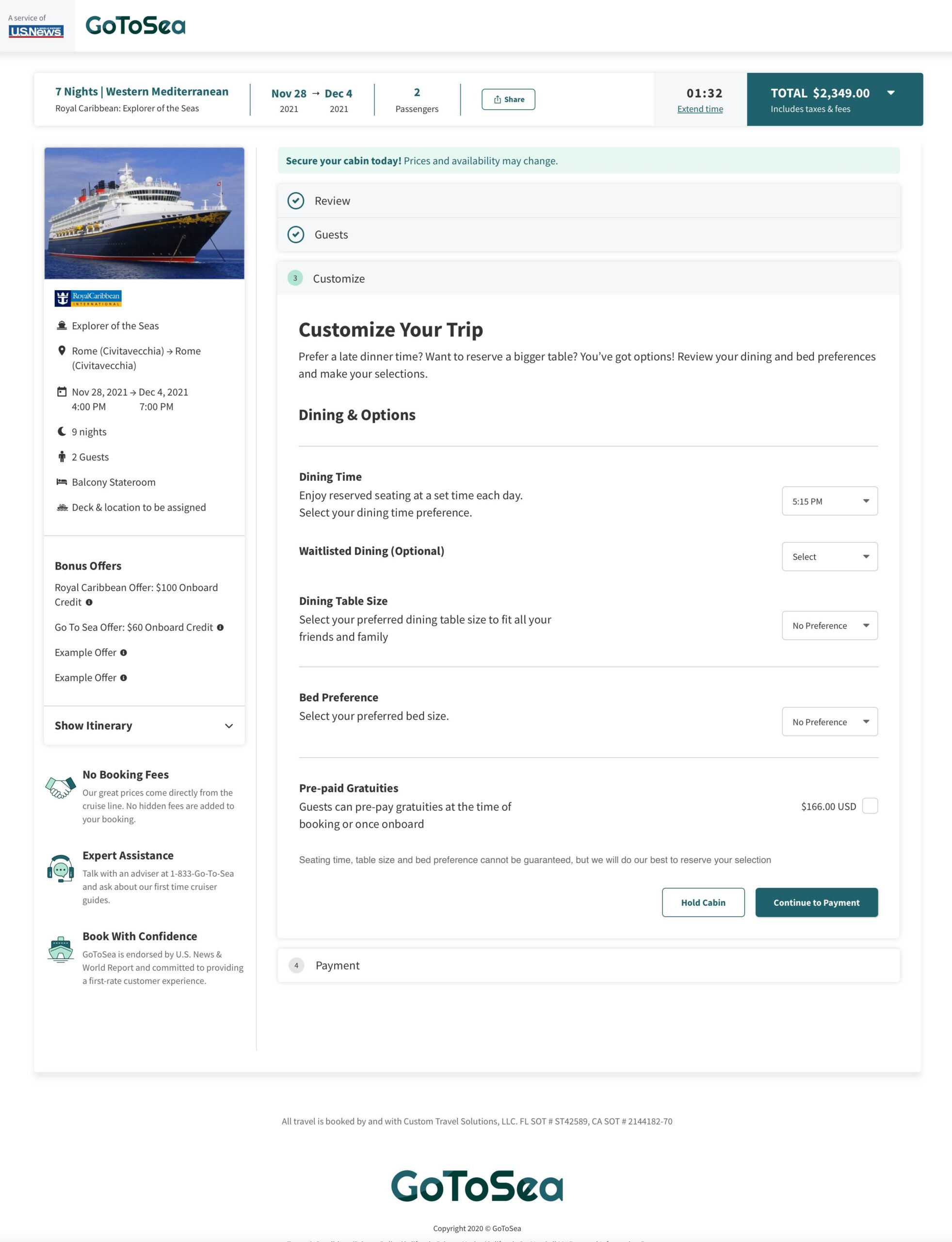
Customize Your Trip
Previously, there were a lot of different options available that were rarely chosen by users. I streamlined the customize page, making it simple for users to make a quick selection and move on to the payment page.
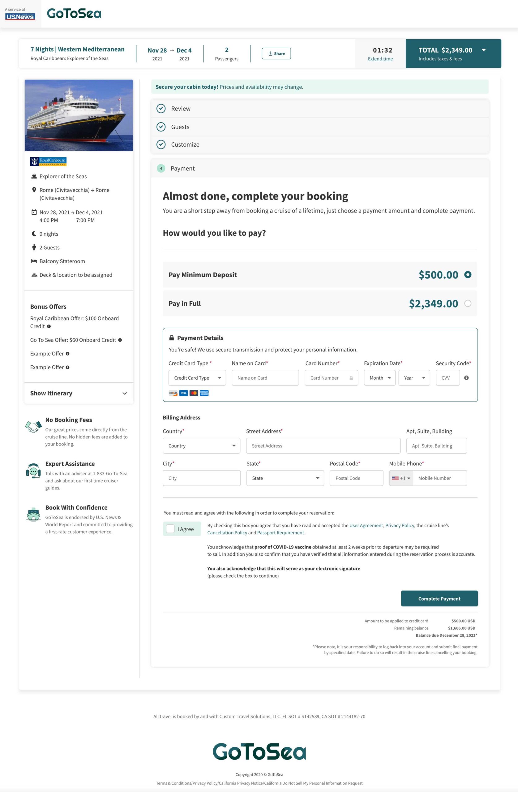
Payment
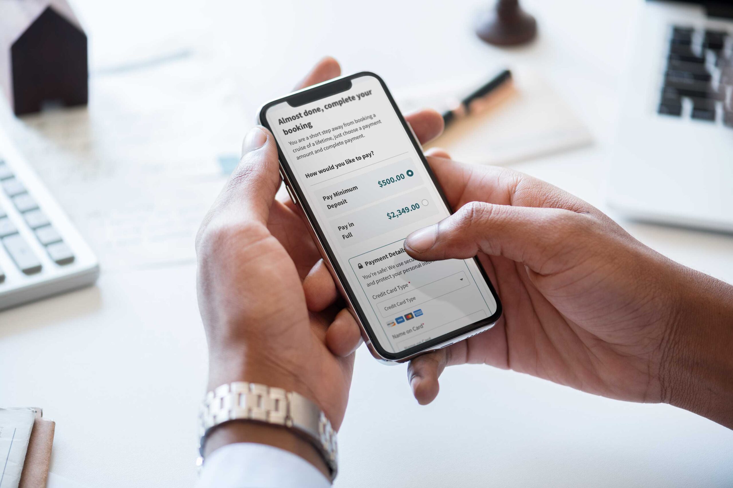
Many users said the payment felt untrustworthy on the previous checkout process. I created a new payment page using secure payment messaging and imagery. The new version also makes it painless to select payment amounts, and form fields have to been updated to match common design patterns.
CONCLUSION
What I would have done different
Working with external tech resources lead to complexities that were not fully understood until part way through the project. It was a great learning experience, and there are several things I would change before beginning a similar project.
Understanding of tech limitations
This was the first time our product team had worked with 3rd party developers, so at the start of the project there were not clear limitations outlined. Because of this, my first designs I submitted to them had to be redone to fit within the development constraints. Having these outlined from the beginning would have drastcially decreased design time.
Outline the number of design variations needed
The cruise booking process can be extremely complex with many variations due to the different services each cruiseline offers. I was unaware of all the differences between each cruiseline before this project, therefore I had to continue to go back and make more variations to fit all cruiselines.
Moderated user interviews
My company has limited tooling when it comes to user testing so all user tests were done unmoderated via usertesting.com. If I were to do this project again, I would want to complete in-person user tests to better understand the pain points with each user's experience in the cruise booking process.
Results
The new checkout design was put in production at the end of May 2022. As of today (5/25/2022), there is only a minimal amount of data since it has only been released a few days ago. Despite this, we are already seeing a small increase in conversions. We are expecting this to continue to grow as we optimize and complete additional user testing.
Next Steps
There are still several small bugs and design tweaks that need to be fixed that were found in QA. Our 3rd party partner will begin fixing these issues this month.
In the upcoming weeks we will begin implementing needed changes seen in user testing post launch.
Thanks for stopping by, let's chat!
